[Robin]: CSS-Tricks started way back in 2007. That’s 15 years! Since then Chris has redesigned the website a bunch of times and with each new version of the site comes a visual refresh, a new trick or two, and the adoption of the latest features of the web platform.
So I thought it would be interesting to go through the archives and look at the design of CSS-Tricks over the years.
2007 / 2008
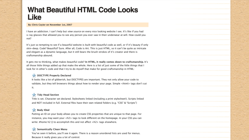
Through the glory of the Internet Archive’s Wayback Machine I was able to find parts of what the homepage looked like back in 2007. Although this isn’t the first version of the site, it’s the earliest I could find. But either way, this version really has it all. Textured wallpaper background images! Small font-sizes! Helvetica and Lucida Grande!
Webfonts didn’t exist in 2007 and so we were stuck with those that were installed on people’s computers. I remember, vaguely, a lot of folks choosing Lucida Grande over everything else because Apple used it everywhere. It was really the only font you could pick that wasn’t Georgia or Verdana.
Sadly though the CSS of this early version of the website hasn’t been fully captured by the Wayback Machine and so parts of the site look pretty janky. Take the footer for example which is just incredible:
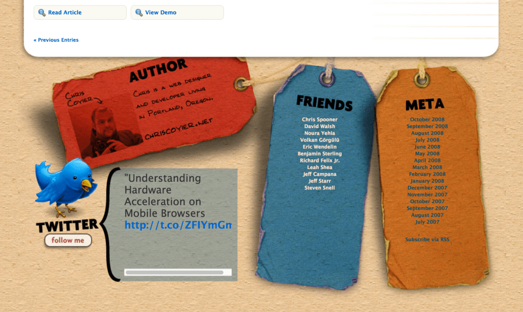
This was part of a trend around this time—if your website had a certain physical-ness to it then it was extremely cool. I mean, I still think this idea of a paper website with real, physical tags at the bottom is cool. But it’s certainly not the dominant aesthetic of the web these days.
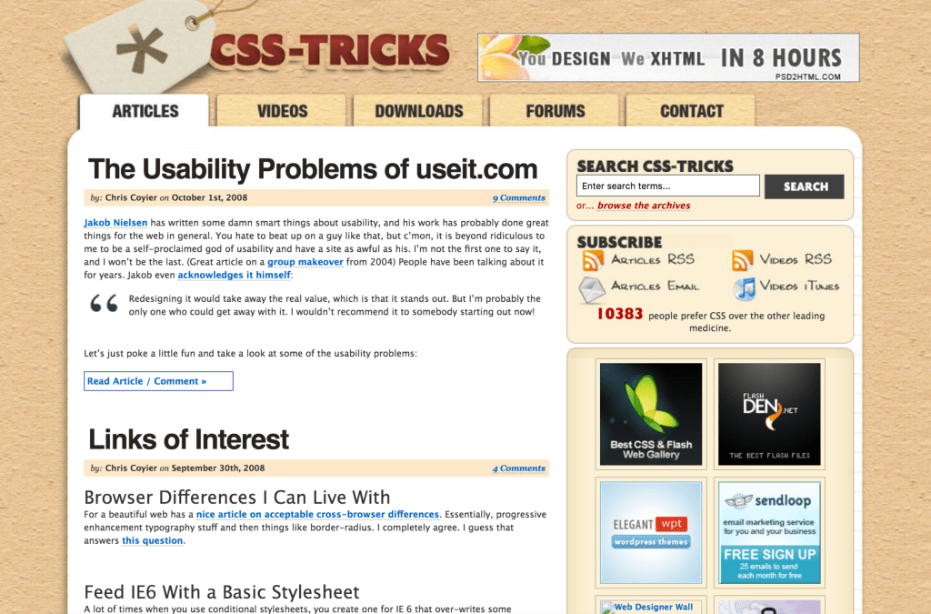
This year things became a bit more complicated, as far as I can tell. The links have a certain depth to them. Everything has a box-shadow! Time cannot kill the wallpaper background.
2009
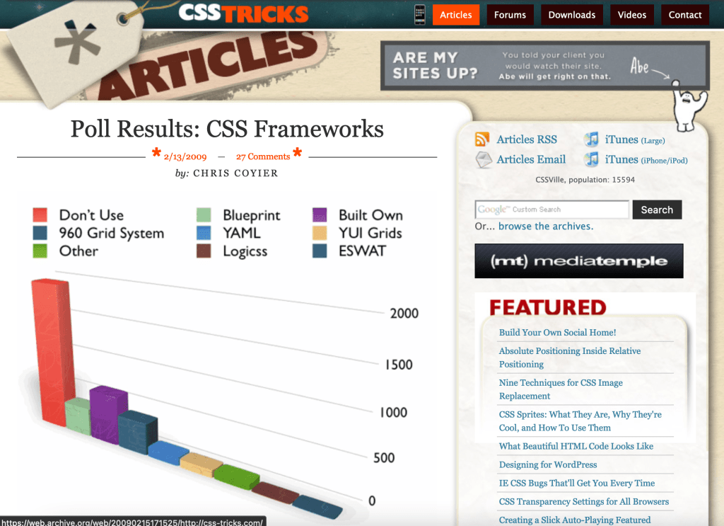
More of a slight variation on the previous year. The wallpaper background is infinite and no-one can stop it. Thee little iPhone in the navigation led to an m-dot site! That is, a special version of the site designed specifically for small screens (m.css-tricks.com). Responsive Web Design wasn’t a thing yet.
2010
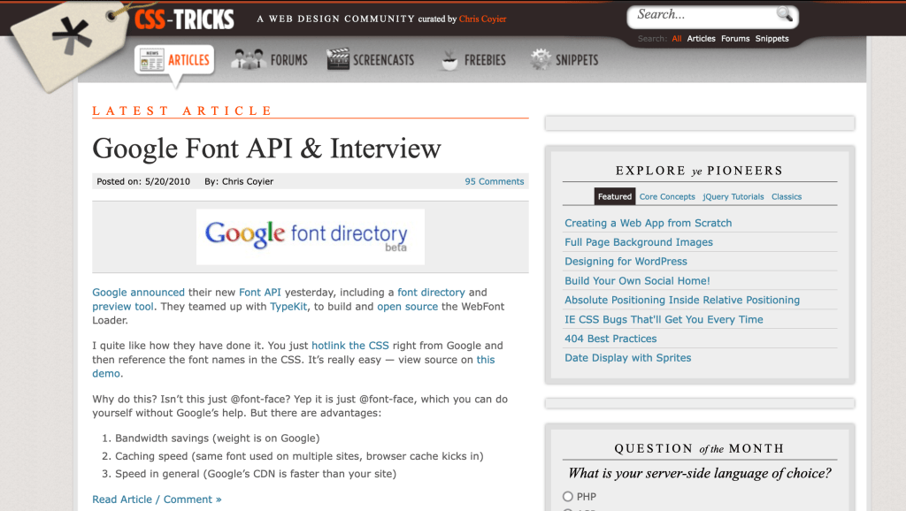
Fancy! It looks like this was the year that CSS-Tricks had webfonts and used FF Tisa (although the font no longer loads correctly today). 2009/2010 was an excellent time for web typography when Firefox 3.5 launched; @font-face suddenly allowed us to use any font that we liked in the browser. We were no longer trapped with Georgia, Verdana, or Lucida Grande. Small caps and OpenType magic became possible.
On that note, I remember one of the first blog posts I ever read about web design was Ian Lynam and Craig Mod’s The Potential of Web Typography.
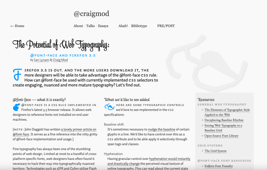
This was also the exciting boom time for CSS when all the buzzwords for the next generation of web technologies started to gain real traction. Jeremy Keith wrote HTML5 for web designers this year and I remember reading that thing voraciously.
2011
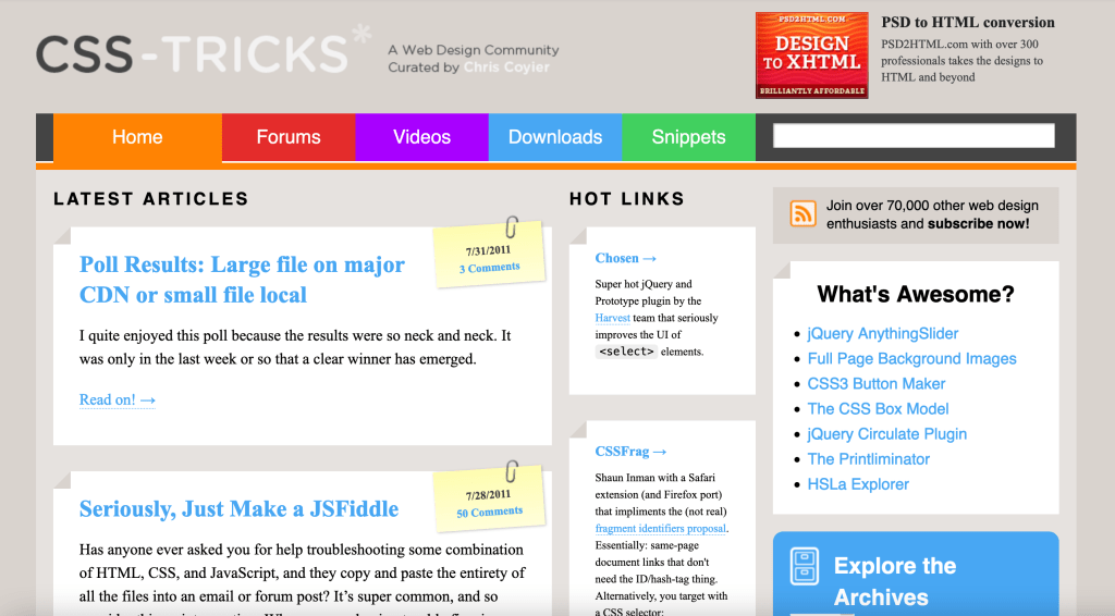
Sadly we can’t see what it looked like with the fonts either here (it was heavy on Gotham Rounded, like the logo), but it’s great to see so much color on the CSS-Tricks website for the first time. And look at those little notes stuck to the top right of each post extract! Those are real honest-to-goodness pseudo elements which also were bundled in Firefox 3.5 back in 2009 but were now started to gain huge traction with web developers.
I can’t imagine making a website without ::after and ::before today.
2012
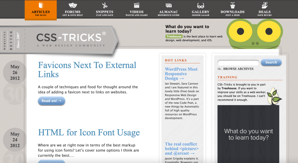
The version of the website that launched in 2012 was interesting visually. I feel like that was the year where us web designers were still in the thrall of paper-esque interfaces; box-shadows, textures, and what not. The colors in the header from 2011 are dimmed out, now only there on hover. But overall there’s more emphasis on depth in the UI. Buttons are big, floating off the page with tons of color and border-radius. (The border-radius CSS property had been available for a few years at this point so I’m guessing this was the style at the time, more so than Chris just playing around with a new thing.)
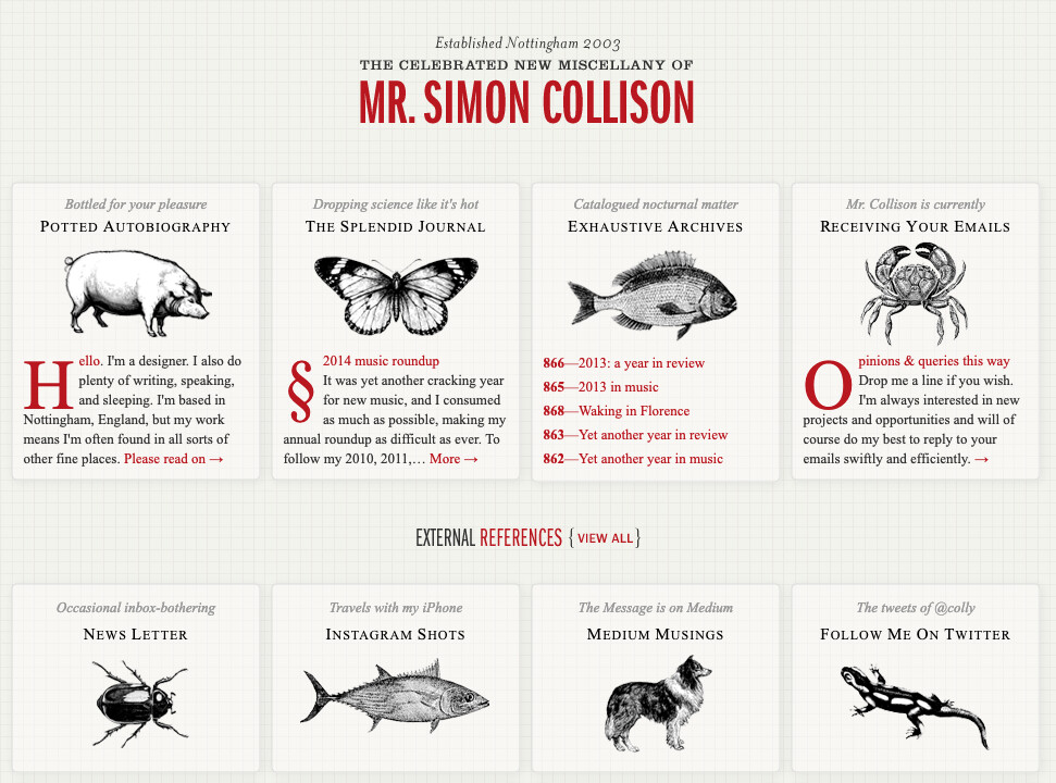
Not sure if this version of the design was inspired by Simon Collison’s rather famous version of his website, but there’s something a bit similar with the borders and the way some of the headings are treated:
The animation on the header—all the colors appear and then fade out of view—was pretty new, with the animation property only being available in browsers recently around this time.
2013
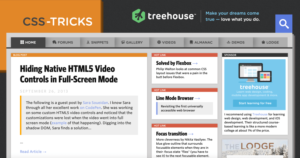
This was a big year. The CSS-Tricks brand as I think of it today really emerged. Big orange colors, big bold type. No flexbox (as far as I can tell). It was around this time that typography across the web started to get bigger, too.
2014
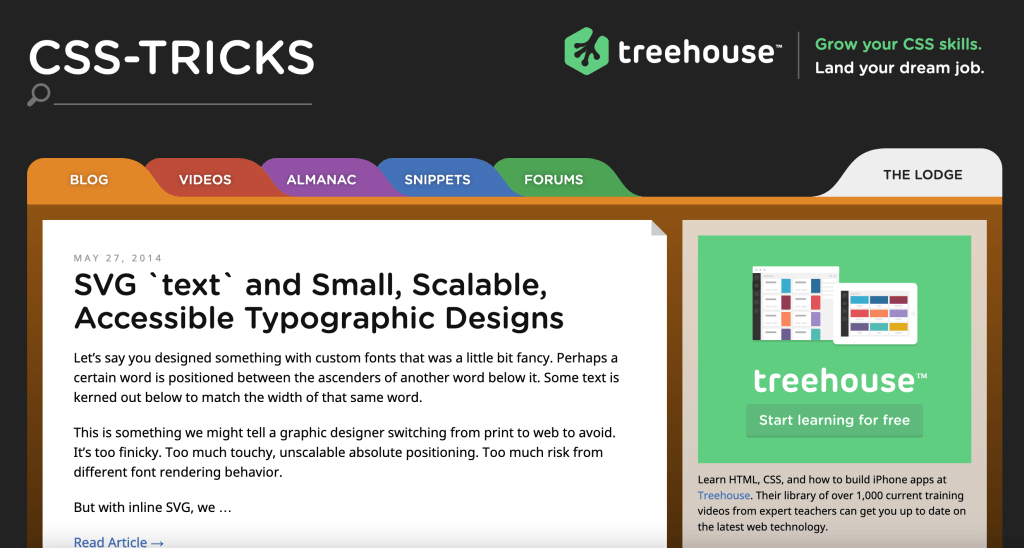
This year all the UI elements became enormous. It’s so easy to click things! Buttons became a bit more subtle at this point and everything in the UI is rounded—even the fonts. I sort of wish that more websites felt like this today. There’s a certain level of confidence I have clicking things with this interface. 10/10.
2015
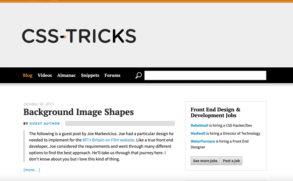
Another big year, although the design took a leap in a very different direction. There’s so much white space! No more cards. Heck, even the buttons become grayed out and less rounded. This one has perhaps my favorite detail of any edition though; a super fun animation designed by the one and only Sarah Drasner.
If you click that little radio-lookin’ button in the header then you’d see something like this:

Fun, fun, fun. But also at the bottom in the footer, something exciting: flexbox! By this point, flexbox had been available in browsers for a while and so I assume it’s not the first time that it was used on the CSS-Tricks website.
2017
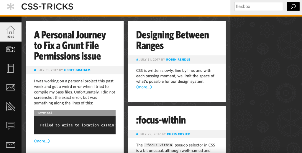
One of the weird properties I saw in here is box-ordinal-group which is a really odd part of the original flexbox spec. There was two different specs for flexbox back in the day and browsers slowly had to get rid of the first one.
In terms of design though; the navigation is now on the left, thin icons dot the interface, with only hints of color in the background. Much higher information density. Still a classic.
2019
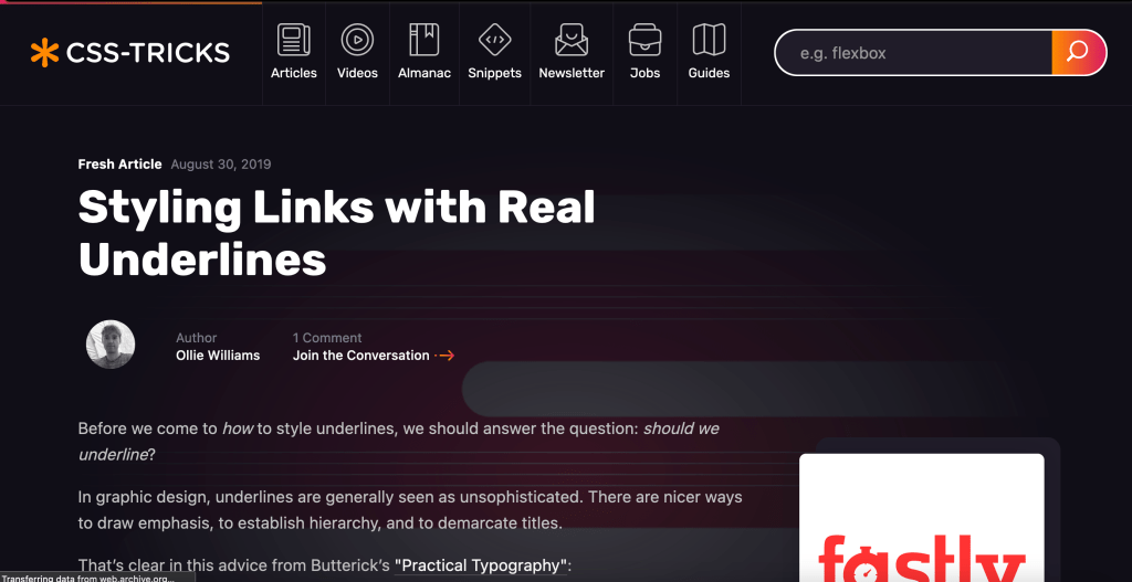
This was a new era for CSS-Tricks, visually. Kylie Timpani designed the site which Chris called v17 when he wrote all about the process behind it. Everything became real dark and goth with a subtle neon-esque hint illuminating the background. Looking back at it now, I feel like this version of the site is very reminiscent of 2014—everything is big and easily clickable.
One CSS thing that Chris used everywhere here are CSS custom properties, like this:
html {
  --maxWidth: 1284px;
}
I think this is definitely when custom properties became not only just useful in web design but downright vital. Today I can’t build a website without them.
This version introduced the mixup section which is still so weird and cool to me. It uses CSS Grid (not sure if this was the first time on the site either) and is just thoroughly buck wild:

2020
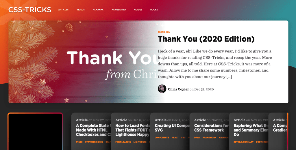
I feel like the design of the site flip flops between really extravagant, wild designs one year, and are then replaced with much more quiet, minimal designs the year after. 2020 was the loud kind and Chris wrote all about this one, too. I like the focus here though; one big, important post at the top and then a ton of popular posts beneath it. It’s much easier navigating the homepage with this design. Also: serifs make their first appearance.
One thing I noted digging around in the CSS is where Chris started to use this technique for responsive typography:
font-size: clamp(2rem, calc(2rem + 1.2vw), 3rem);With clamp() you can set a min, ideal, and max size of something. Real smart stuff.
2021
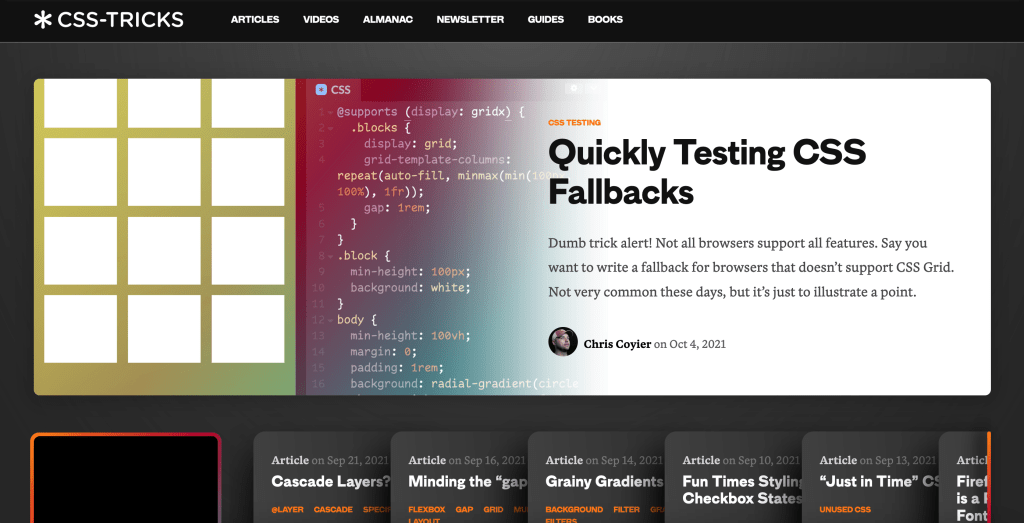
A more refined approach, this one. The most notable change here being the pink neon background replaced for a dark gray. But I think even though all the color has been taken out of the navigation, it means you end up focusing way more on the content.
(This makes me wonder if Chris is working on a more punk rock version for 2022 though. We shall see…)
Okay, so that’s it for now!
The fun part of all this is seeing how browsers have improved over time, how new features propagated or became popular sometimes years after they became available in browsers. It shows us when CSS3 accelerated the development of our field and how our trends and tastes changed over time; from icon design, to typography, to what we expect interfaces to look like every day.
That’s what I find so interesting here, really; the history of CSS-Tricks is the history of the web at large.

Sponsor
Raygun empowers developers to detect, diagnose, and resolve errors with ease
Stop relying on log files or support tickets with incomplete information. Get deeper insights into the root cause of errors and crashes with diagnostics that take you down to the exact line of code.
[Chris]: Thank you so much for that trip down memory lane Robin! There is a little bit more of it at Design History if you wanna screenshots that I try to remember to grab when switching versions. Sadly it’s mostly the homepage, and I wish I had stuff like article pages and the 404 page and stuff, but alas I don’t.
There is an awful lot of fun in these old designs. Some of the stuff that is even harder to dig up is the interactions. Once Responsive Web Design did become a thing, I remember having a lot of fun with the Treehouse frog mascot (they were our major sponsor at the time). At different screen sizes, I would totally change the absolute positioning of different “parts” of the frog, and other aspects like color, shape, and size. So when the new screen size hit, they logo would (rather slowly! on purpose!).
Imagine you have a “shape”, positioned, then you make sure it’s got a nice luxuriously slow transition on everything:
.thing {
  position: absolute;
  border-radius: 50%;
  width: 100px;
  height: 100px;
  background: #81c784;
  left: 80%;
  top: -20px;

  transition: 3s;
}
Then after some state change, maybe a new class name, maybe a toggle, maybe a media query, we change things:
@media (max-width: 1000px) {
  .one {
    left: 10%;
    top: 92%;
    width: 200px;
  }
}
Imagine the screen is resizing underneath this (gotta do a GIF because this is an email):

That GIF is kinda slow-framerate-sad, so here’s a tweet with a movie. If I can, I’ll try to get more weird with some future redesign ;).