Virtual conferences have changed the game in terms of how a presenter is able to deliver content to an audience. At a live event it’s likely you just have your laptop, but at home, you may have multiple monitors so that you can move around windows and make off-screen changes when delivering live coding demos. However, as some events go back to in-person, you may be in a similar boat as me wondering how to bring an equivalent experience to a live venue.
With a bit of creativity using native web functionality and modern CSS, like CSS scroll snap, we’ll be building a no-JavaScript slide deck that allows live editing of CSS demos. The final deck will be responsive and shareable, thanks to living inside of a CodePen.
To make this slide deck, we’ll learn about:
- CSS scroll snap, counters, and grid layout
- The
contenteditableattribute - Using custom properties and HSL for theming
- Gradient text
- Styling the
<style>element
Slide templates
When making a slide deck of a bunch of different slides, it’s likely that you’ll need different types of slides. So we’ll create these three essential templates:
- Text: open for any text you need to include
- Title: emphasizing a headline to break up sections of content
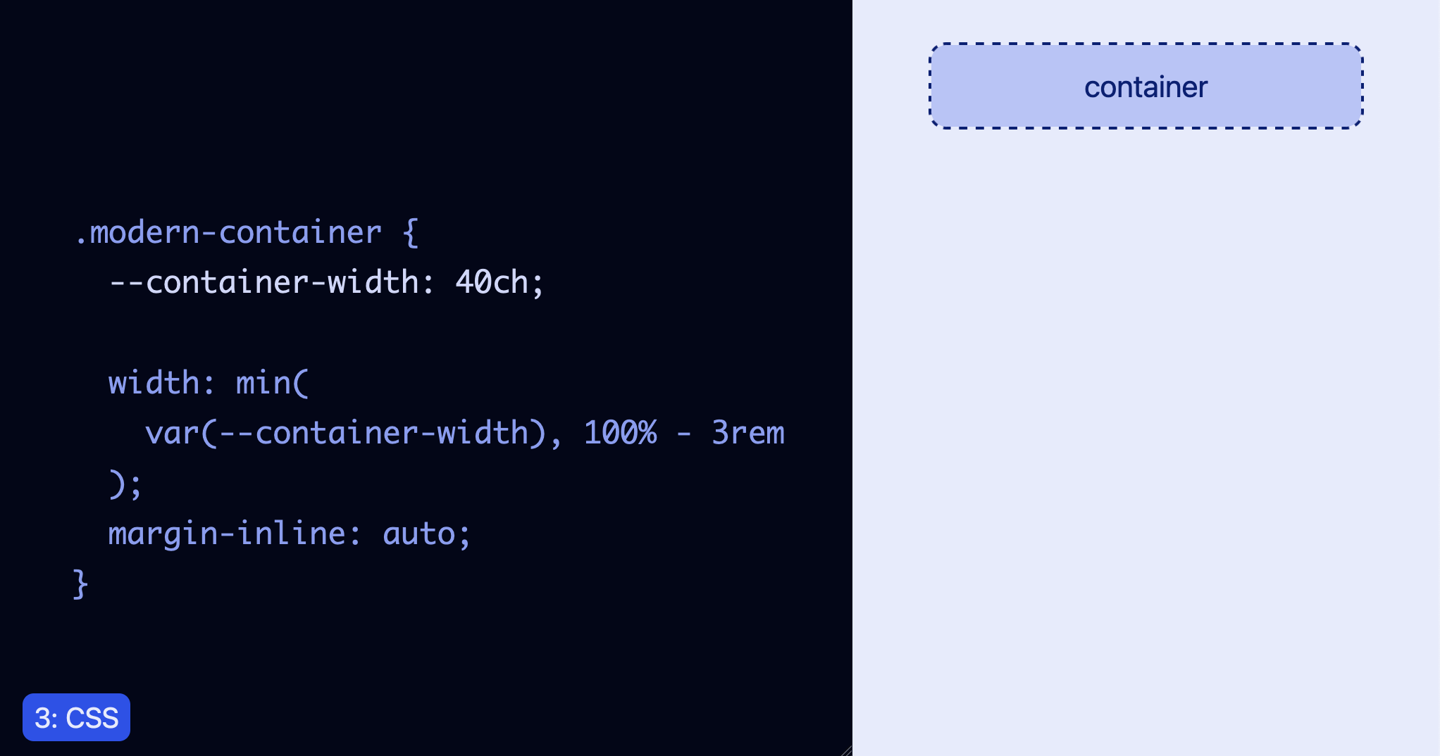
- Demo: split layout with a code block and the preview
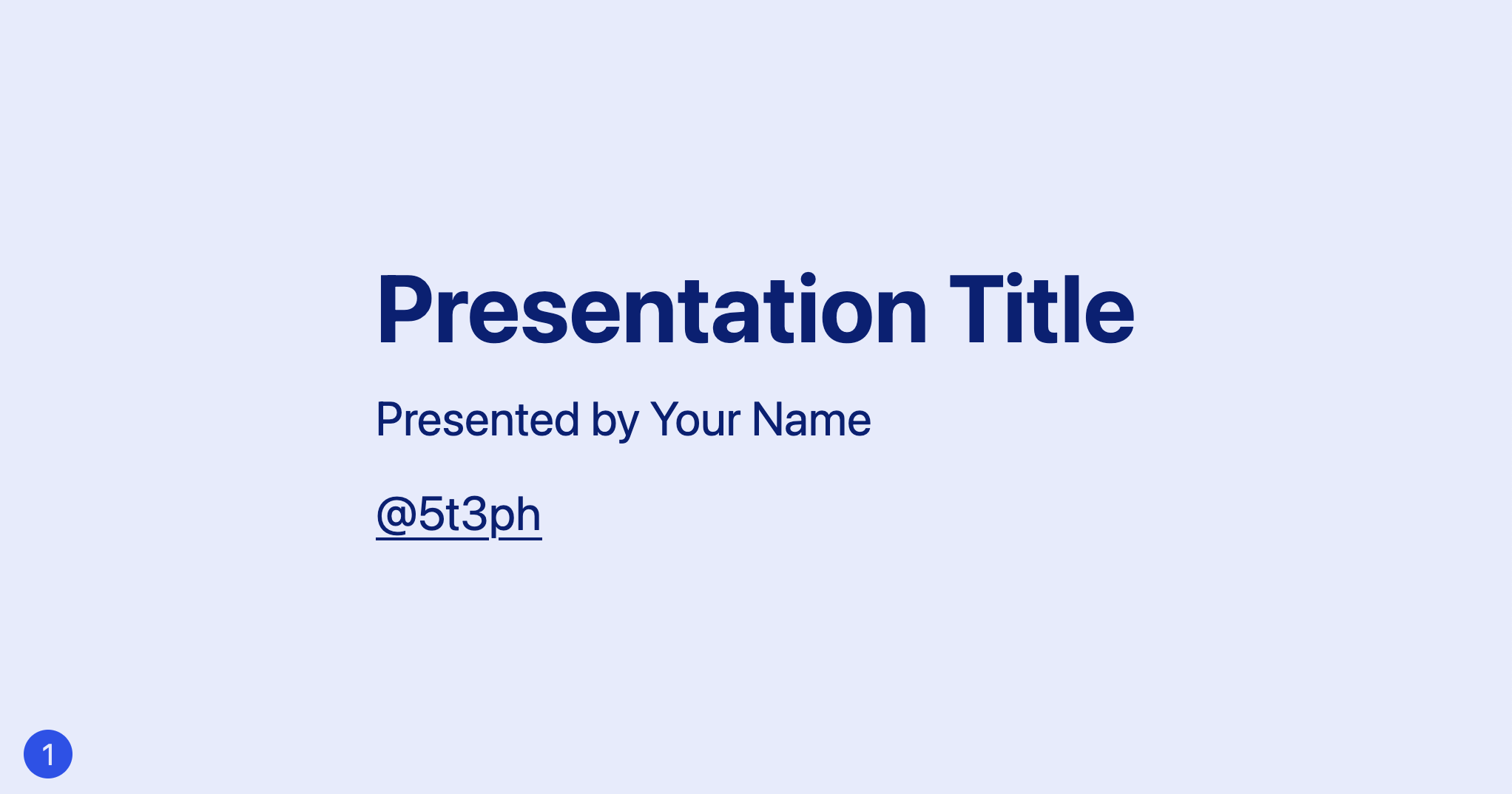

HTML templates
Let’s start creating our HTML. We’ll use an ordered list with the ID of slides and go ahead and populate a text and title slide.
Each slide is one of the list elements with the class of slide, as well as a modifier class to indicate the template type. For these text-based slides, we’ve nested a <div> with the class of content and then added a bit of boilerplate text.
<ol id="slides">
  <li class="slide slide--text">
    <div class="content">
      <h1>Presentation Title</h1>
      <p>Presented by Your Name</p>
      <p><a target="_blank" href="<https://twitter.com/5t3ph>">@5t3ph</a></p>
    </div>
  </li>
  <li class="slide slide--title">
    <div class="content">
      <h2>Topic 1</h2>
    </div>
  </li>
</ol>
We’re using target="_blank" on the link due to CodePen using iframes for the preview, so it’s necessary to “escape” the iframe and load the link.
Base styles
Next, we’ll begin to add some styles. If you are using CodePen, these styles assume you’re not loading one of the resets. Our reset wipes out margin and ensures the <body> element takes up the total available height, which is all we really need here. And, we’ll make a basic font stack update.
* {
  margin: 0;
  box-sizing: border-box;
}

body {
  min-height: 100vh;
  font-family: system-ui, sans-serif;
  font-size: 1.5rem;
}
Next, we’ll define that all our major layout elements will use a CSS grid, remove list styling from #slides, and make each slide take up the size of the viewport. Finally, we’ll use the place-content shorthand to center the slide--text and slide--title slide content.
body,
#slides,
.slide {
  display: grid;
}

#slides {
  list-style: none;
  padding: 0;
  margin: 0;
}

.slide {
  width: 100vw;
  height: 100vh;
}

.slide--text,
.slide--title {
  place-content: center;
}
Then, we’ll add some lightweight text styles. Since this is intended to be a presentation with one big point being made at a time, as opposed to an article-like format, we’ll bump the base font-size to 2rem. Be sure to adjust this value as you test out your final slides in full screen. You may decide it feels too small for your content versus your presentation viewport size.
h1, h2 {
  line-height: 1.1;
}

a {
  color: inherit;
}

.content {
  padding: 2rem;
  font-size: 2rem;
  line-height: 1.5;
}

.content * + * {
  margin-top: 0.5em;
}

.slide--text .content {
  max-width: 40ch;
}
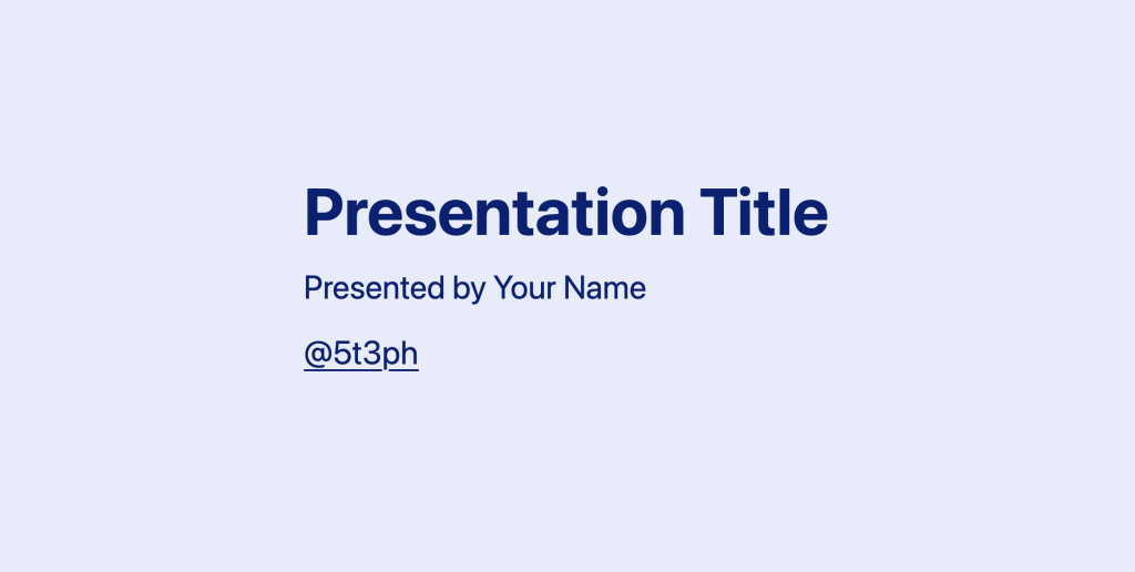
At this point, we have some large text centered within a container the size of the viewport. Let’s add a touch of color by creating a simple theme system.
We’ll be using the hsl color space for the theme while setting a custom property of --theme-hue and --theme-saturation. The hue value of 230 corresponds to a blue. For ease of use, we’ll then combine those into the --theme-hs value to drop into instances of hsl.
:root {
  --theme-hue: 230;
  --theme-saturation: 85%;
  --theme-hs: var(--theme-hue), var(--theme-saturation);
}
We can adjust the lightness values for backgrounds and text. The slides will feel cohesive since they will be tints of that base hue.
Back in our main <body> style, we can apply this idea to create a very light version of the color for a background, and a dark version for the text.
body {
  /* ... existing styles */
  background-color: hsl(var(--theme-hs), 95%);
  color: hsl(var(--theme-hs), 25%);
}
Let’s also give .slide--title a little bit of extra pizazz by adding a subtle gradient background.
.slide--title {
  background-image:
    linear-gradient(125deg,
      hsl(var(--theme-hs), 95%),
      hsl(var(--theme-hs), 75%)
    );
}
Demo slide template
Our demo slide breaks the mold so far and requires two main elements:
- a
.stylecontainer around an inline<style>element with actual written styles that you intend to both be visible on screen and apply to the demo - a
.democontainer to hold the demo preview with whatever markup is appropriate for that
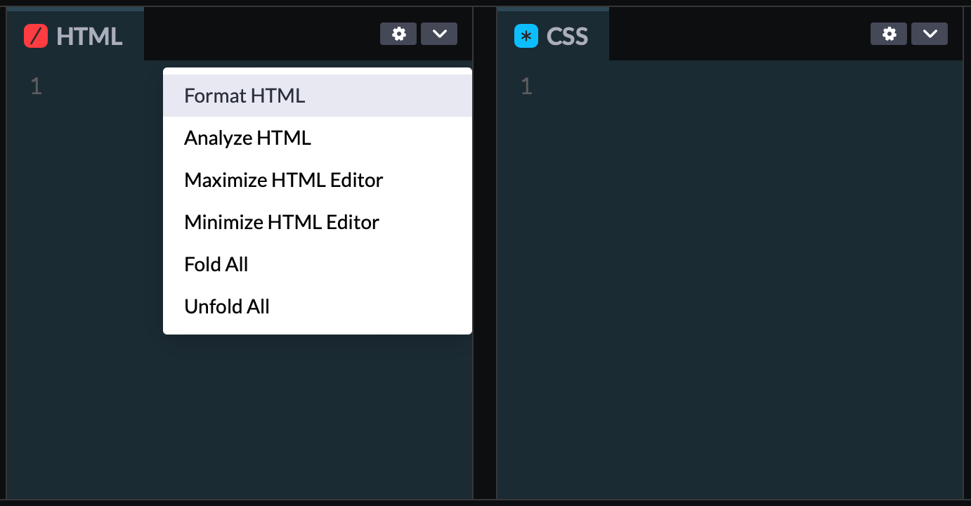
If you’re using CodePen to create this deck, you’ll want to update the “Behavior” setting to turn off “Format on Save.” This is because we don’t want extra tabs/spaces prior to the styles block. Exactly why will become clear in a moment.
Here’s our demo slide content:
<li class="slide slide--demo">
  <div class="style">
  <style contenteditable="true">
.modern-container {
  --container-width: 40ch;

  width: min(
    var(--container-width), 100% - 3rem
  );
  margin-inline: auto;
}
  </style>
  </div>
  <div class="demo">
    <div class="modern-container">
      <div class="box">container</div>
    </div>
  </div>
</li>
Note that extra contenteditable="true" attribute on the <style> block . This is a native HTML feature that allows you to mark any element as editable. It is not a replacement for form inputs and textareas and typically requires JavaScript for more full-featured functionality. But for our purposes, it’s the magic that enables “live” coding. Ultimately, we’ll be able to make changes to the content in here and the style changes will apply immediately. Pretty fancy, hold tight.
However, if you view this so far, you won’t see the style block displayed. You will see the outcome of the .modern-container demo styles are being applied, though.
Another relevant note here is that HTML5 included validating a <style> block anywhere; not just in the <head>.
What we’re going to do next will feel strange, but we can actually use display properties on <style> to make it visible. We’ve placed it within another container to use a little extra positioning for it and make it a resizable area. Then, we’ve set the <style> element itself to display: block and applied properties to give it a code editor look and feel.
.style {
  display: grid;
  align-items: center;
  background-color: hsl(var(--theme-hs), 5%);
  padding-inline: max(5vw, 2rem) 3rem;
  font-size: 1.35rem;
  overflow-y: hidden;
  resize: horizontal;
}

style {
  display: block;
  outline: none;
  font-family: Consolas, Monaco, "Andale Mono", "Ubuntu Mono", monospace;
  color: hsl(var(--theme-hs), 85%);
  background: none;
  white-space: pre;
  line-height: 1.65;
  tab-size: 2;
  hyphens: none;
}
Then, we need to create the .slide--demo rule and use CSS grid to display the styles and demo, side-by-side. As a reminder, we’ve already set up the base .slide class to use grid, so now we’ll create a rule for grid-template-columns just for this template.
.slide--demo {
  grid-template-columns: fit-content(85ch) 1fr;
}
If you’re unfamiliar with the grid function fit-content(), it allows an element to use its intrinsic width up until the maximum value defined in the function. So, this rule says the style block can grow to a maximum of 85ch wide. When your <style> content is narrow, the column will only be as wide as it needs to be. This is really nice visually as it won’t create extra horizontal space while still ultimately capping the allowed width.
To round out this template, we’ll add some padding for the .demo. You may have also noticed that extra class within the demo of .box. This is a convention I like to use for demos to provide a visual of element boundaries when the size and position of something are important.
.demo {
  padding: 2rem;
}

.box {
  background-color: hsl(var(--theme-hs), 85%);
  border: 2px dashed;
  border-radius: .5em;
  padding: 1rem;
  font-size: 1.35rem;
  text-align: center;
}
Here’s the result of our code template:
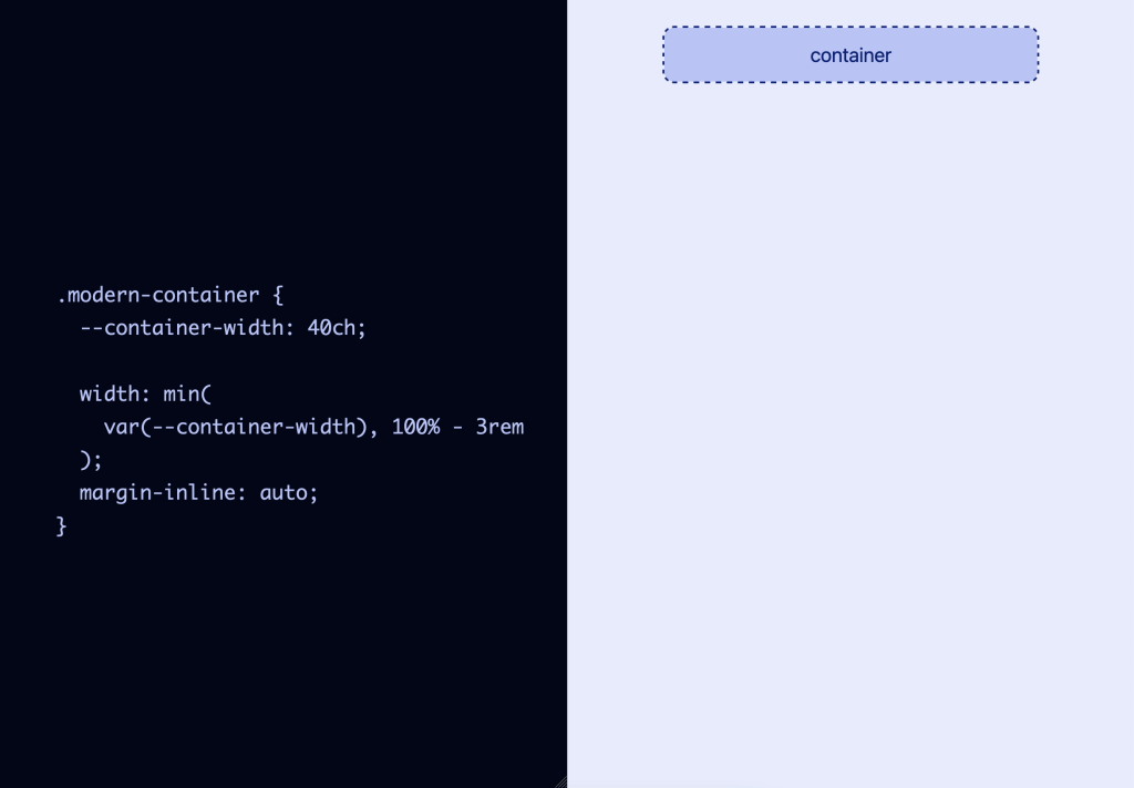
Live-editing functionality
Interacting with the displayed styles will actually update the preview! Additionally, since we created the .style container as a resizable area, you can grab the resize handle in the lower right to grow and shrink the preview area as needed.
The one caveat for our live-editing ability is that browsers treat it differently.
- Firefox: This provides the best result as it allows both changing the loaded styles and full functionality of adding new properties and even new rules.
- Chromium and Safari: These allow changing values in loaded styles, but not adding new properties or new rules.
As a presenter, you’ll likely want to use Firefox. As for viewers utilizing the presentation link, they’ll still be able to get the intention of your slides and shouldn’t have issues with the display (unless their browser doesn’t support your demoed code). But outside of Firefox, they may be unable to manipulate the demos as fully as you may show in your presentation.
You may want to “Fork” your finished presentation pen and actually remove the editable behavior on <style> blocks and instead display final versions of your demos styles, as applicable.
Reminder: styles you include in demos can potentially affect slide layout and other demos! You may want to scope demo styles under a slide-specific class to prevent unintended style changes across your deck.
Code highlighting
While we won’t be able to achieve full syntax highlighting without JavaScript, we can create a method to highlight certain parts of the code block for emphasis.
To do this, we’ll pair up linear-gradient with the -webkit properties that enable using an element’s background as the text effect. Then, using custom properties, we can define how many “lines” of the style block to highlight.
First, we’ll place the required -webkit properties directly on the <style> element. This will cause the visible text to disappear, but we’ll make it visible in a moment by adding a background. Although these are -webkit prefixed, they are supported cross-browser.
style {
  /* ...existing styles */
  -webkit-text-fill-color: transparent;
  -webkit-background-clip: text;
}
The highlighting effect will work by creating a linear-gradient with two colors where the lighter color shows through as the text color for the lines to highlight. As a default, we’ll bookend the highlight with a darker color such that it appears that the first property is highlighted.
Here’s a preview of the initial effect:
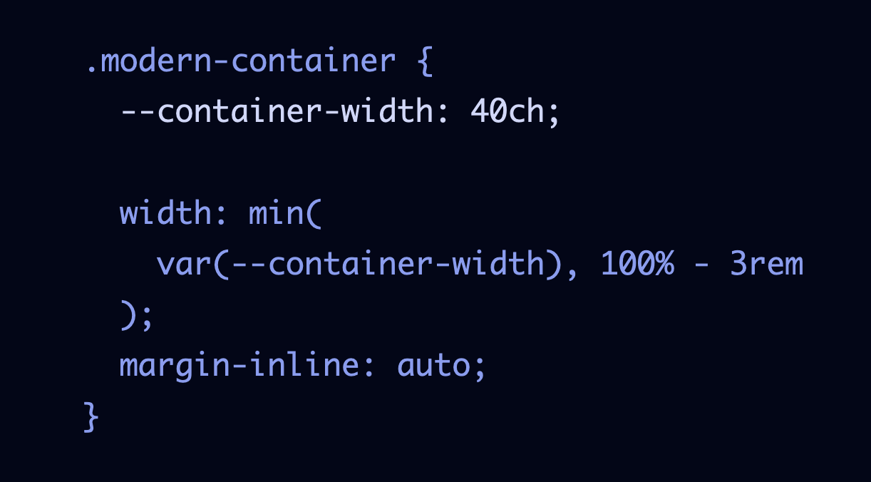
To create this effect, we need to work out how to calculate the height of the highlight color. In our <style> element’s rules, we’ve already set the line-height to 1.65, which corresponds to a total computed line height of 1.65em. So, you may think that we multiply that by the number of lines and call it a day.
However, due to the visible style block being rendered using white-space: pre to preserve line breaks, there’s technically a sneaky invisible line before the first line of text. This is created from formatting the <style> tag on an actual line prior to the first line of CSS code. This is also why I noted that preventing auto-formatting in CodePen is important — otherwise, you would also have extra left padding.
With these caveats in mind, we’ll set up three custom properties to help compute the values we need and add them to the beginning of our .style ruleset. The final --lines height value first takes into account that invisible line and the selector.
style {
  --line-height: 1.65em;
  --highlight-start: calc(2 * var(--line-height));
  --lines: calc(var(--highlight-start) + var(--num-lines, 1) * var(--line-height));
}
Now we can apply the values to create the linear-gradient. To create the sharp transitions we need for this effect, we ensure the gradient stops from one color to the next match.
style {
  background-image: linear-gradient(
    hsl(var(--theme-hs), 75%) 0 var(--highlight-start),
    hsl(var(--theme-hs), 90%) var(--highlight-start) var(--lines),
    hsl(var(--theme-hs), 75%) var(--lines) 100%
  );
}
To help visualize what’s happening, I’ve commented out the -webkit lines to reveal the gradient being created.
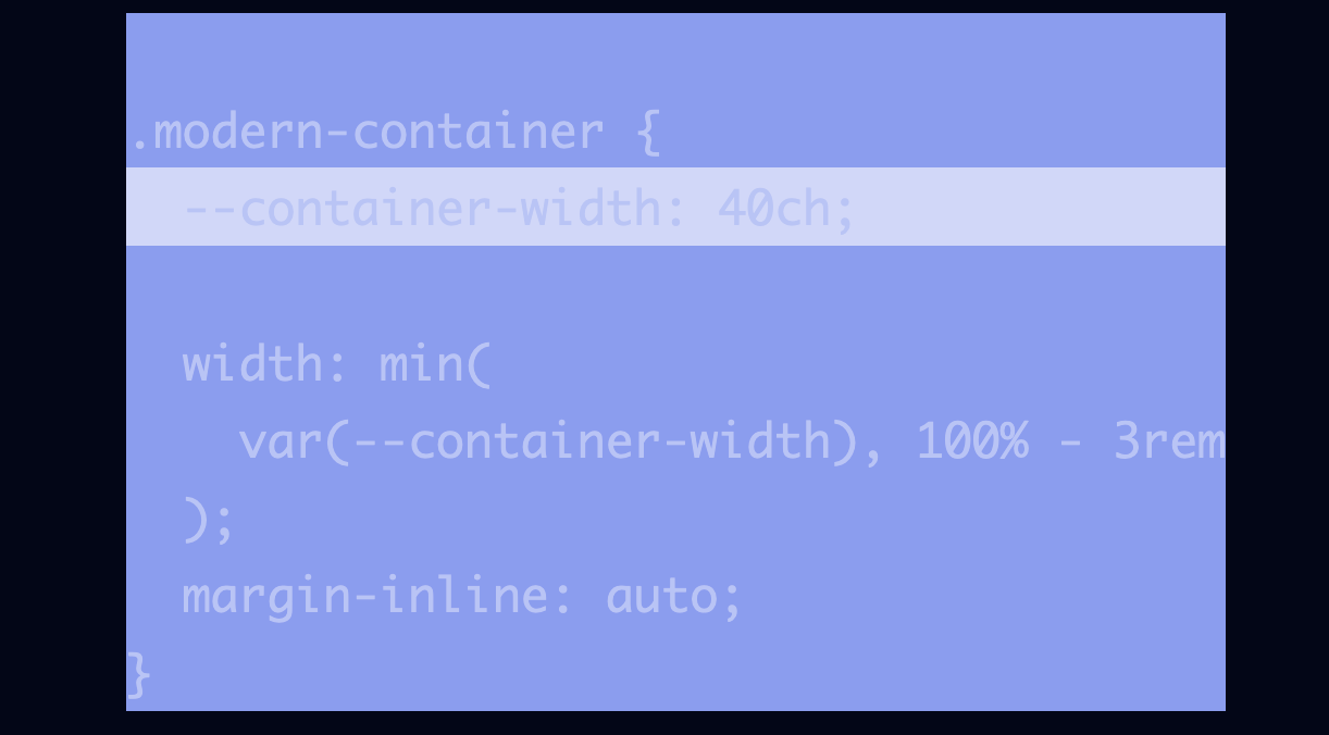
Within our --lines calculation, we also included a --num-lines property. This will let you adjust the number of lines to highlight per demo via an inline style. This example adjusts the highlight to three lines:
<style contenteditable="true" style="--num-lines: 3">We can also pass a recalculated --highlight-start to change the initial line highlighted:
<style contenteditable="true" style="--num-lines: 3; --highlight-start: calc(4 * var(--line-height))">Let’s look at the outcome of the previous adjustment:
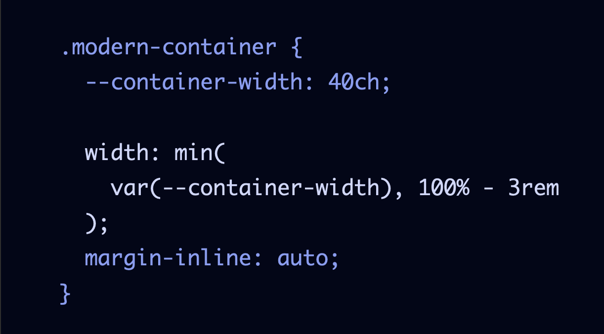
Now, if you add or remove lines during your presentation, the highlighting will not adjust. But it’s still nice as a tool to help direct your viewers’ attention.
There are two utility classes we’ll add for highlighting the rule only or removing highlighting altogether. To use, apply directly to the <style> element for the demo.
.highlight--rule-only {
  --highlight-start: calc(1 * var(--line-height))
}

.highlight--none {
  background-image: none;
  background-color: currentColor;
}
Slide motion with CSS scroll snap
Alright, we have some nice-looking initial slides. But it’s not quite feeling like a slide deck yet. We’ll resolve that in two parts:
- Reflow the slides horizontally
- Use CSS scroll snap to enforce scrolling one slide at a time
Our initial styles already defined the #slides ordered list as a grid container. To accomplish a horizontal layout, we need to add one extra property since the .slides have already included dimensions to fill the viewport.
#slides {
  /* ...existing styles */
  grid-auto-flow: column;
}
For CSS scroll snap to work, we need to define which axis allows overflow, so for horizontal scrolling, that’s x:
#slides {
  overflow-x: auto;
}
The final property we need for scroll snapping for the #slides container is to define scroll-snap-type. This is a shorthand where we select the x axis, and the mandatory behavior, which means initiating scrolling should always trigger snapping to the next element.
#slides {
  scroll-snap-type: x mandatory;
}
If you try it at this point, you won’t experience the scroll snapping behavior yet because we have two properties to add to the child .slide elements. Use of scroll-snap-align tells the browser where to “snap” to, and setting scroll-snap-stopto always prevents scrolling past one of the child elements.
.slide {
  /* ...existing styles */
  scroll-snap-align: center;
  scroll-snap-stop: always;
}
The scroll snapping behavior should work either by scrolling across your slide or using left and right arrow keys.
There are more properties that can be set for CSS scroll snap, you can review the MDN docs to learn what all is available. CSS scroll snap also has a bit different behavior cross-browser, and across input types, like touch versus mouse, or touchpad versus mouse wheel, or via scrollbar arrows. For our presentation, if you find that scrolling isn’t very smooth or “snapping” then try using arrow keys instead.
Currently, there isn’t a way to customize the CSS scroll snap sliding animation easing or speed. Perhaps that is important to you for your presentation, and you don’t need the other features we’ve developed for modifying the code samples. In that case, you may want to choose a “real” presentation application.
CSS scroll snap is very cool but also has some caveats to be aware of if you’re thinking of using it beyond our slide deck context. Check out another scroll snapping demo and more information on SmolCSS.dev.
Slide numbers
An optional feature is adding visible slide numbers. Using a CSS counter, we can get the current slide number and display it however we’d like as the value of a pseudo-element. And using data attributes, we can even append the current topic.
The first step is giving our counter a name, which is done via the counter-reset property. This is placed on the element that contains items to be counted, so we’ll add it to #slides.
#slides {
  counter-reset: slides;
}
Then, on the elements to be counted (.slide), we add the counter-increment property and callback to the name of the counter we defined.
.slide {
  counter-increment: slides;
}
To access the current count, we’ll set up a pseudo element. Within the content property, the counter() function is available. This function accepts the name of our counter and returns the current number.
.slide::before {
  content: counter(slides);
}
The number is now appearing but not where we want it. Because our slide content is variable, we’ll use classic absolute positioning to place the slide number in the bottom-left corner. And we’ll add some visual styles to make it enclosed in a nice little circle.
.slide::before {
  content: counter(slides);
  position: absolute;
  left: 1rem;
  bottom: 1rem;
  width: 1.65em;
  height: 1.65em;
  display: grid;
  place-content: center;
  border-radius: 50%;
  font-size: 1.25rem;
  color: hsl(var(--theme-hs), 95%);
  background-color: hsl(var(--theme-hs), 55%);
}
We can enhance our slide numbers by grabbing the value of a data attribute to also append a short topic title. This means first adding an attribute to each <li> element where we want this to happen. We’ll add data-topic to the <li> for the title and code demo slides. The value can be whatever you want, but shorter strings will display best.
<li class="slide slide--title" data-topic="CSS">We’ll use the attribute as a selector to change the pseudo element. We can get the value by using the attr() function, which we’ll concatenate with the slide number and add a colon for a separator. Since the element was previously a circle, there are a few other properties to update.
[data-topic]::before {
  content: counter(slides) ": " attr(data-topic);
  padding: 0.25em 0.4em;
  width: auto;
  border-radius: 0.5rem;
}
With that added, here’s the code demo slide showing the added topic of “CSS”:

Small viewport styles
Our slides are already somewhat responsive, but eventually, there will be problems with horizontal scrolling on smaller viewports. My suggestion is to remove the CSS scroll snap and let the slides flow vertically.
To accomplish this will just be a handful of updates, including adding a border to help separate slide content.
First, we’ll move the CSS scroll snap related properties for #slides into a media query to only apply above 120ch.
@media screen and (min-width: 120ch) {
  #slides {
    grid-auto-flow: column;
    overflow-x: auto;
    scroll-snap-type: x mandatory;
  }
}
Next, we’ll move the CSS scroll snap and dimension properties for .slide into this media query as well.
@media screen and (min-width: 120ch) {
  .slide {
    width: 100vw;
    height: 100vh;
    scroll-snap-align: center;
    scroll-snap-stop: always;
  }
}
To stack the demo content, we’ll move our entire rule for .slide--demo into this media query:
@media screen and (min-width: 120ch) {
  .slide--demo {
    grid-template-columns: fit-content(85ch) 1fr;
  }
}
Now everything is stacked, but we want to bring back a minimum height for each slide and then add the border I mentioned earlier:
@media (max-width: 120ch) {
  .slide {
    min-height: 80vh;
  }

  .slide + .slide {
    border-top: 1px dashed;
  }
}
Your content also might be at risk of overflow on smaller viewports, so we’ll do a couple of adjustments for .content to try to prevent that We’ll add a default width that will be used on small viewports, and move our previous max-width constraint into the media query. Also shown is a quick method updating our <h1> to use fluid type.
h1 {
  font-size: clamp(2rem, 8vw + 1rem, 3.25rem);
}

.content {
  /* remove max-width rule from here */
  width: calc(100vw - 2rem);
}

@media screen and (min-width: 120ch) {
  .content {
    width: unset;
    max-width: 45ch;
  }
}
Additionally, I found it helps to reposition the slide counter. For that, we’ll adjust the initial styles to place it in the top-left, then move it back to the bottom in our media query.
.slide {
  /* adjust default here, removing the old "bottom" value */
  top: 0.25rem;
  left: 0.25rem;
}

@media (min-width: 120ch) {
  .slide::before {
    top: auto;
    bottom: 1rem;
    left: 1rem;
  }
}
Final slide deck
The embed will likely be showing the stacked small viewport version, so be sure to open the full version in CodePen, or jump to the live view. As a reminder, the editing ability works best in Firefox.
If you’re interested in seeing a fully finished deck in action, I used this technique to present my modern CSS toolkit.
This is genius!!! I’ve always thought that scroll-snap was limited to just image carousels, but didn’t know it could be used so ingeniously for a slide deck. :-)
That is beautiful! I wish I had seen this article 3 years ago.