DigitalOcean provides cloud products for every stage of your journey. Get started with $200 in free credit!
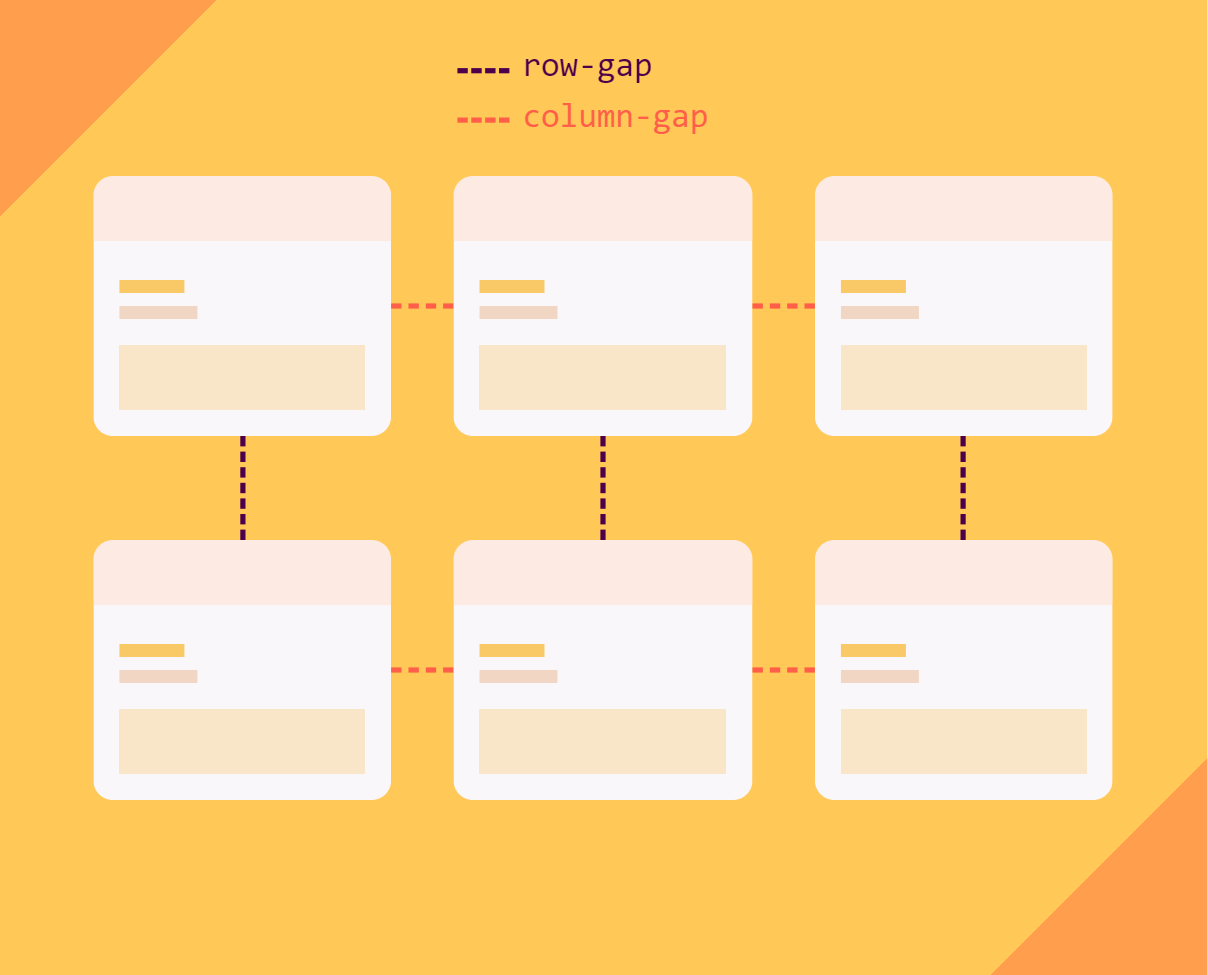
The gap property in CSS is a shorthand for row-gap and column-gap, specifying the size of gutters, which is the space between rows and columns within grid, flex, and multi-column layouts.
/* Grid layout */
.container {
  display: grid;
  grid-template-columns: repeat(3, 1fr);
  grid-template-rows: 1fr 2fr 1fr;
  gap: 30px 20px;
}

/* Flex layout */
.container {
  display: flex;
  gap: 10%;
}

/* Multi-column layout */
.container {
  column-count: 5;
  gap: 20px;
}
Use the slider in the demo below to see the gap property in action:
Syntax
gap accepts one or two values:
- A single value sets both
row-gapandcolumn-gapby the same value. - When two values are used, the first sets the
row-gapand the second sets thecolumn-gap.
.container {
  gap: 1rem;
  /* Is equivalent to:
  *  row-gap: 1rem;
  *  column-gap: 1rem
  */

  gap: 10px 15%;
  /* Is equivalent to:
  *  row-gap: 10px;
  *  column-gap: 15%;
  */
}
The specification for the CSS Grid Layout Module defined the space between grid tracks using the grid-gap property. gap is intended to replace it so that gaps can be defined in multiple CSS layout methods, like flexbox, but grid-gap still needs to be used in instances where a browser may have implemented grid-gap but has yet to start supporting the newer gap property.
Values
gap accepts the following values:
normal: (Default) The browser will specify a used value of 1em for multi-column layout and 0px for all other layout contexts (i.e. grid and flex).<length>: Any valid and non-negative CSS length, such aspx,em,remand%, among others.<percentage>: The size of the gap as a non-negative percentage value relative to the dimension of the element. (See below for details.)initial: Applies the property’s default setting, which isnormal.inherit: Adopts the gap value of the parent.unset: Removes the currentgapfrom the element.
Percentages in gap properties
When the size of a container in the gap dimension is definite, gap resolves percentages against the size of the container’s content box in any layout types.

In other words, when the browser knows the size of the container, it can calculate the percentage value of the gap. For example, when the container’s height is 100px and the gap is set to 10%, browser knows that 10% of 100px is 10px.
But when the browser doesn’t know the size, it will wonder, “10% of what?” In these cases, gap behaves differently based on the layout type.
In a grid layout, percentages resolve against zero for determining intrinsic size contributions, but resolve against the element’s content box when laying out the box’s contents, meaning it will put space between items but the space doesn’t affect the container’s size.
In this demo, the container’s height is not definite. See what happens when you increase the gap size. Then set the gap in pixel units and try again:
In a flex layout, percentages resolve against zero in all cases, meaning that gaps will not apply when the size of the container is not known to the browser:
Using the calc() function with gap
You can use calc() function to specify the size of the gap but, at the time of this writing, there is no support for it on Safari and iOS.
.flex-layout {
  display: flex;
  gap: calc(5vh + 5px) calc(5vw + 5px);
}


.grid-layout {
  display: grid;
  grid-template-columns: repeat(3, 1fr);
  gap: calc(5vmin + 5px);
}
Examples
The gap property is designed for use in grid, flex and multi-column layouts. Let’s check out some examples.
Grid layout
In the following demo, you can see gap being used to specify the row-gap and column-gap properties on a grid container, defining the gutters between grid rows and grid columns, respectively:
Flex layout
Applying gap to the main axis of a flex container indicates spacing between flex items in a single line of the flex layout.
Here’s column-gap used in a row direction:
Here’s row-gap used in a column direction:
Applying gap to the cross axis of a flex container indicates spacing between flex lines of the flex layout.
Here’s row-gap in a row direction:
Here’s column-gap in a column direction:
Multi-column layout
column-gap appears in multi-column layouts to create gaps between column boxes, but note that row-gap has no effect since we’re only working in columns. gap can still be used in this context, but only the column-gap will be applied.
As you can see in the next demo, although the gap property has a value of 2rem, it’s only separating items horizontally instead of both directions since we’re working in columns:
The more you know…
There are a couple of things worth noting about working with the gap property.
It’s a nice way to prevent unwanted spacing
Have you ever used margins to create spacing between elements? If we’re not careful, we can end up with extra spacing before and after the group of items.
Solving that usually requires adding negative margins or resorting to pseudo-selectors to remove margin from specific items. But the nice thing about using gap in more modern layout methods is that you only have space between items. The extra cruft at the start and end is never an issue!
But, hey, if you want to have space around the items while using gap, put padding around the container like this:
.container {
  display: flex;
  gap: 1rem;
  padding: 1rem;
}
Gutter size is not always equal to the gap value
The gap property is not the only thing that can put space between items. Margins, paddings, justify-content and align-content can also increase the size of the gutter and affect the actual gap value.
In the following example, we’re setting a 1em gap but, as you can see, there is much more space between the items, caused by the use of distributed alignments, like justify-content and align-content:
Browser support
Feature queries are usually a nice way to check if a browser supports a specific property, but in this case, if you check for the gap property in flexbox, you may get a false positive because a feature query won’t distinguish between layout modes. In other words, it might be supported in a flex layout which results in a positive result, but it is actually not supported if it’s used in a grid layout.
Grid layout
| IE | Edge | Firefox | Chrome | Safari | Opera |
|---|---|---|---|---|---|
| No | 16+ | 61+ | 66+ | 12+ | 53+ |
| iOS Safari | Opera Mobile | Android Browser | Chrome for Android | Firefox for Android |
|---|---|---|---|---|
| 12+ | No | 81+ | 84+ | 68+ |
Grid layout with calc() values
| IE | Edge | Firefox | Chrome | Safari | Opera |
|---|---|---|---|---|---|
| No | 84+ | 79+ | 84+ | No | 69+ |
| iOS Safari | Opera Mobile | Android Browser | Chrome for Android | Firefox for Android |
|---|---|---|---|---|
| No | No | 81+ | 84+ | 68+ |
Grid layout with percentage value
| IE | Edge | Firefox | Chrome | Safari | Opera |
|---|---|---|---|---|---|
| No | 84+ | 79+ | 84+ | No | 69+ |
| iOS Safari | Opera Mobile | Android Browser | Chrome for Android | Firefox for Android |
|---|---|---|---|---|
| No | No | 81+ | 84+ | 68+ |
Flex layout
The specification for using gap with flexbox is currently in Working Draft status.
This browser support data is from Caniuse, which has more detail. A number indicates that browser supports the feature at that version and up.
Desktop
| Chrome | Firefox | IE | Edge | Safari |
|---|---|---|---|---|
| 84 | 63 | No | 84 | 14.1 |
Mobile / Tablet
| Android Chrome | Android Firefox | Android | iOS Safari |
|---|---|---|---|
| 126 | 127 | 126 | 14.5-14.8 |
Multi-column layout
| IE | Edge | Firefox | Chrome | Safari | Opera |
|---|---|---|---|---|---|
| No | 84+ | 79+ | 84+ | No | 69+ |
| iOS Safari | Opera Mobile | Android Browser | Chrome for Android | Firefox for Android |
|---|---|---|---|---|
| No | No | 81+ | 84+ | 68+ |
More information
- CSS Box Alignment Module Level 3
- Chromium lands Flexbox gap (Ticket #761904)
- WebKit CSS Feature Status
- Grid Layout
- Flexbox Layout
- Multi-Column Layout
- CSS Grid Layout: An Introduction (Alligator.io)