CSS Container Queries are still gaining traction and many of us are getting our hands wet with them, even if it’s for little experiments or whatnot. They’ve got great, but not quite full, browser support — enough to justify using them in some projects, but maybe not to the extent where we might be tempted to start replacing media queries from past projects with shiny new container size queries.
They sure are handy though! In fact, I’ve already run into a few situations where I really wanted to reach for them but just couldn’t overcome the support requirements. If I had been able to use them, this is how it would have looked in those situations.
All of the following demos will be best viewed in Chrome or Safari at the time of this writing. Firefox plans to ship support in Version 109.
Case 1: Card grid
You kind of had to expect this one, right? It’s such a common pattern that all of us seem to run into it at some point. But the fact is that container size queries would have been a huge time-saver for me with a better outcome had I been able to use them over standard media queries.
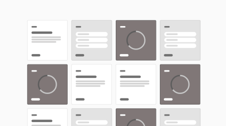
Let’s say you’ve been tasked with building this card grid with the requirement that each card needs to keep it’s 1:1 aspect ratio:

It’s tougher than it looks! The problem is that sizing a component’s contents on the viewport’s width leaves you at the mercy of how the component responds to the viewport — as well the way any other ancestor containers respond to it. If, for example, you want the font size of a card heading to reduce when the card hits a certain inline size there’s no reliable way to do it.
You could set the font size in vw units, I suppose, but the component is still tied to the browser’s viewport width. And that can cause problems when the card grid is used other in contexts that may not have the same breakpoints.
In my real-world project, I landed on a JavaScript approach that would:
- Listen for a resize event.
- Calculate the width of each card.
- Add an inline font size to each card based on its width.
- Style everything inside using
emunits.
Seems like a lot of work, right? But it is a stable solution to get the required scaling across different screen sizes in different contexts.
Container queries would have been so much better because they provide us with container query units, such as the cqw unit. You probably already get it, but 1cqw is equal to 1% of a container’s width. We also have the cqi unit that’s a measure of a container’s inline width, and cqb for a container’s block width. So, if we have a card container that is 500px wide, a 50cqw value computes to 250px.
If I had been able to use container queries in my card grid, I could have set up the .card component as a container:
.card {
  container: card / size;
}
Then I could have set an inner wrapper with padding that scales at 10% of the .card‘s width using the cqw unit:
.card__inner {
  padding: 10cqw;
}
That’s a nice way to scale the spacing between the card’s edges and its contents consistently no matter where the card is used at any given viewport width. No media queries required!
Another idea? Use cqw units for the font size of the inner contents, then apply padding in em units:
.card__inner {
  font-size: 5cqw;
  padding: 2em;
}
5cqw is an arbitrary value — just one that I settled on. That padding is still equal to 10cqw since the em unit is relative to the .card__inner font size!
Did you catch that? The 2em is relative to the 5cqw font size that is set on the same container. Containers work different than what we’re used to, as em units are relative to the same element’s font-size value. But what I quickly noticed is that container query units relate to the nearest parent that is also a container.
For example, 5cqw does not scale based on the .card element’s width in this example:
.card {
  container: card / size;
  container-name: card;
  font-size: 5cqw;
}
Rather, it scales to whatever the nearest parent that’s defined as a container. That’s why I set up a .card__inner wrapper.
Case 2: Alternating layout
I needed yet another card component in a different project. This time, I needed the card to transition from a landscape layout to a portrait layout… then back to landscape, and back to portrait again as the screen gets smaller.

I did the dirty work of making this component go to portrait at those two specific viewport ranges (shout out to the new media query range syntax!), but again, the problem is that it is then locked to the media queries set on it, its parent, and anything else that might respond to the viewport’s width. We want something that works in any condition without worrying about wondering where the content is going to break!
Container queries would have made this a breeze, thanks to the @container rule:
.info-card {
  container-type: inline-size;
  container-name: info-card;
}

@container info-card (max-width: 500px) {
  .info-card__inner {
    flex-direction: column;
  }
}
One query, infinite fluidity:
But hold on! There’s something you might want to watch out for. Specifically, it could be difficult to use a container query like this within a prop-based design system. For example, this .info-card component could contain child components that rely on props to change their appearance.
Why’s that a big deal? The card’s portrait layout might require the alternate styling but you can’t change JavaScript props with CSS. As such, you risk duplicating the required styles. I actually touched on this and how to work around it in another article. If you need to use container queries for a significant amount of your styling, then you may need to base your entire design system around them rather than trying to shoehorn them into an existing design system that’s heavy on media queries.
Case 3: SVG strokes
Here’s another super common pattern I’ve recently used where container size queries would have resulted in a more polished product. Say you have an icon locked up with a heading:
<h2>
  <svg>
    <!-- SVG stuff -->
  </svg>
  Heading
</h2>
It’s pretty straightforward to scale the icon with the title’s size, even without media queries. The problem, though, is that the SVG’s stroke-width might get too thin to be noticed all that well at a smaller size, and perhaps catch too much attention with a super thick stroke at a larger size.
I’ve had to create and apply classes to each icon instance to determine its size and stroke width. That’s OK if the icon is next to a heading that’s styled with a fixed font size, I guess, but it’s not so great when working with fluid type that constantly changes.

The heading’s font size might be based on the viewport’s width, so the SVG icon needs to adjust accordingly where its stroke works at any size. You could make the stroke width relative to the heading’s font-size by setting it in em units. But if you have a specific set of stroke sizes that you need to stick to, then this wouldn’t work because it otherwise scales linearly — there’s no way to adjust it to a specific stroke-width value at certain points without resorting to media queries on the viewport width.
But here’s what I would have done if I had the luxury of container queries at that time:
.icon {
  container: icon / size;
  width: 1em;
  height: 1em;
}

.icon svg {
  width: 100%;
  height: 100%;
  fill: none;
  stroke: #ccc;
  stroke-width: 0.8;
}

@container icon (max-width: 70px) {
  .icon svg {
    stroke-width: 1.5;
  }
}
@container icon (max-width: 35px) {
  .icon svg {
    stroke-width: 3;
  }
}
Compare the implementations and see how the container query version snaps the SVG’s stroke to the specific widths I want based on the container’s width.
Bonus: Other types of container size queries
OK, so I haven’t actually run into this on a real project. But as I was combing through information on container queries, I noticed that there are additional things we can query on a container that are related to the container’s size or physical dimensions.
Most examples I’ve seen query the width, max-width, and min-width, height, block-size, and inline-size as I’ve been doing throughout this article.
@container info-card (max-width: 500px) {
  .info-card__inner {
    flex-direction: column;
  }
}
But MDN outlines two more things we can query against. One is orientation which makes perfect sense because we use it all the time in media queries. It’s no different with container queries:
@media screen (orientation: landscape) {
  .info-card__inner {
    /* Style away! */
  }
}

@container info-card (orientation: landscape) {
  .info-card__inner {
    /* Style away! */
  }
}
The other? It’s aspect-ratio, believe it or not:
@container info-card (aspect-ratio: 3/2) {
  .info-card__inner {
    /* Style away! */
  }
}
Here’s an editable demo to play around with both examples:
I haven’t really found a good use case for either of these yet. If you have any ideas or feel like it could’ve helped you in your projects, let me know in the comments!
Great article Dan, can’t wait to get stuck in with these!
Great examples! Worth noting that you can prevent SVG strokes from scaling by adding the property
vector-effect="non-scaling-stroke"to the element.Well written article. Thanks for sharing, tailwind have added support for them too