I know there are a ton of pure CSS cube tutorials out there. I’ve done a few myself. But for mid-2017, when CSS Custom Properties are supported in all major desktop browsers, they all feel… outdated and very WET. I thought I should do something to fix this problem, so this article was born. It’s going to show you the most efficient path towards building a CSS cube that’s possible today, while also explaining what common, but less than ideal cube coding patterns you should steer clear of. So let’s get started!
HTML structure
The HTML structure is the following: a .cube element with .cube__face children (6 of them). We’re using Haml so that we write the least amount of code possible:
.cube
  - 6.times do
    .cube__face
We’re not using .front, .back and classes like that. They’re not useful because they bloat the code and make it less logical. Instead, we’ll use :nth-child() to target the faces. We don’t need to worry about browser support for that, since we’re building something with 3D transforms here, which assumes much newer browser support!
Basic styles
All these elements are absolutely positioned:
[class*='cube'] { position: absolute }The .cube is the child of a scene element which is the body in our case because we want to keep things as simple as possible. If we had multiple 3D shapes within the scene and we wanted them to interact in a 3D manner, then our cube would have been a child of that assembly and the assembly would have been a child of the scene.
We make the body cover the entire viewport and set a perspective on it so that whatever is closer looks bigger and whatever is further away looks smaller.
body {
  height: 100vh;
  perspective: 25em
}
Something else that I often like to do when the full-height body is the scene is to set the font-size on the .cube such that it depends on the minimum viewport dimension. This makes our whole cube scale nicely with the viewport if I then set the cube dimensions in em units.
.cube { font-size: 8vmin }The reason why I’m not setting the cube dimensions directly in vmin units is an Edge bug.
We then give the .cube element a transform-style of preserve-3d so that its cube children don’t get flattened into its plane in case we decide to animate it and we put it in the middle of the scene using top and left offsets. This is the initial positioning of the cube and it’s best to use offsets, not a translate() transform for this. I’ve seen that sometimes people get confused about this because they’ve heard that, for performance reasons, it’s better to use transforms, not offsets… that’s true, but it applies for animating the position, not for the initial positioning. The very simple rule here is: use offsets or margins, whichever is more convenient at that point for initial positioning, use transforms from animating the position starting from that initial position.
.cube {
  top: 50%; left: 50%;
  transform-style: preserve-3d;
}
We then pick a cube edge length and set it as the width and height of the cube faces. We also give the faces a negative margin of minus half the cube edge so that they’re dead in the middle. Again, this is related to the initial positioning the cube faces. We also give them a box-shadow just so that we can see them.
$cube-edge: 8em;

.cube__face {
  margin: -.5*$cube-edge;
  width: $cube-edge; height: $cube-edge;
  box-shadow: 0 0 0 2px;
}
I often see code where transform-style: preserve-3d has been set on everything. That’s unnecessary and a misunderstanding of how preserve-3d works. It’s only necessary to set it on something that’s going to have a 3D transform applied (right away, following user interaction, via an auto-running animation… doesn’t matter how) and has 3D transformed children. In our particular case, that’s just the .cube element. The scene doesn’t get transformed in 3D and the .cube__face elements don’t have children.
Another unnecessary thing I see is setting explicit dimensions on the .cube element. This element isn’t visible. We don’t have any text directly in it, we’re not setting and backgrounds, borders or shadows on it. Its only purpose here is to serve as a container whose position we can animate in order to easily move all its face children at once, in the same way. Not setting any dimensions on this absolutely positioned .cube element means that its dimensions are computed to 0x0, so it’s also pointless to set any %-value offsets on its face children. top: 0 is the exact same thing as top: 50% or as any other percent value for an element whose parent has 0x0 dimensions. The same is valid for all the other offsets (right, bottom, left).
I’ve been asked why not set top and left for the .cube to calc(50% - #{.5*$cube-edge}) and remove the margin from the .cube__face altogether if I care about compacting code so much. Well, that’s because the two don’t really produce the same result, even though the .cube__face elements do end up in the middle of the screen in both cases. To illustrate this, let’s give our .cube element a red box-shadow just so that we can see it and check out the two cases side by side:
See the Pen by thebabydino (@thebabydino) on CodePen.
In the above demo, our .cube element is positioned differently in the two cases. When using the calc() value for its offsets and skipping the margin on its children, its position doesn’t coincide with the middle of the scene anymore, but with the top left corner of its face children. So what? It’s not going to be visible in our actual demo anyway…
While that’s true, a different position also means a different transform-origin. And that changes things if we decide to rotate or scale our .cube (and that’s something we decided we’d do). So consider the following keyframe animation for our cube:
@keyframes rot { to { transform: rotateY(1turn) } }This is a rotation around the cube’s y axis. The result is not the same for the two cases:
See the Pen by thebabydino (@thebabydino) on CodePen.
In both cases, the faces rotate around the y axis of their parent cube, but the position of this y axis relative to the faces is different. It coincides with the faces’ y axes in the initial case, and with the faces’ left edges in the second case. This is the reason why I’m not bringing the negative margin of the cube faces into the offsets of the parent cube: it would impact animating the cube in 3D.
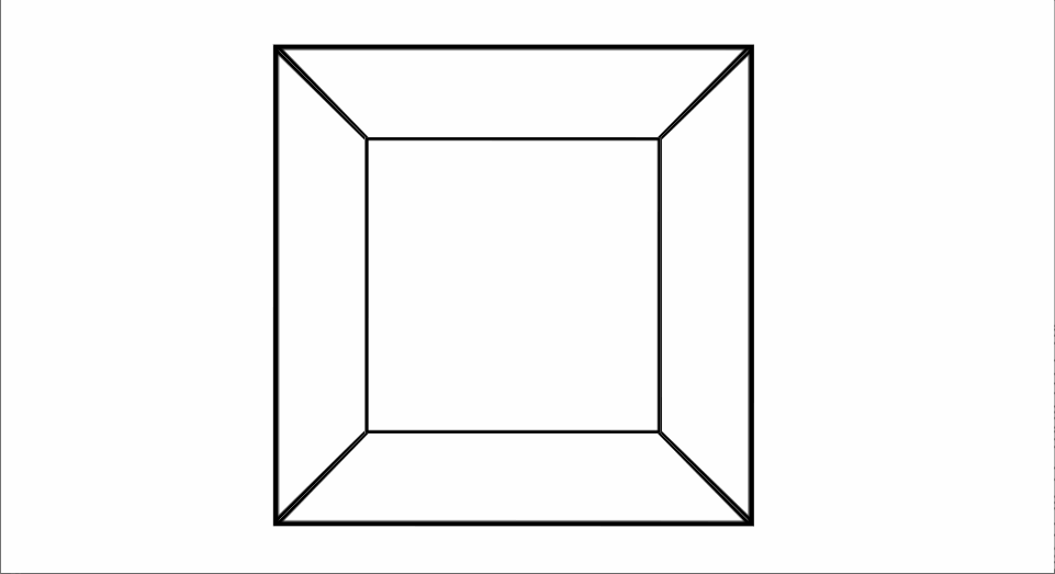
Building the cube with transforms
What we have in the demos above isn’t a cube yet. In order to do that, we need to position the faces in 3D. There are multiple transform combinations that achieve the same effect, but the most efficient and logical one is to start by rotating the first four faces in increments of 90° around one of the axes in their plane (x or y) and the remaining two faces by ±90° around the other axis in the same plane. Then we chain a translation of half the cube edge length along the axis that’s perpendicular onto their plane (their z) axis.
A very detailed explanation of how translations and rotations work as well as how we get the transform chains for creating a cuboid can be found in this older article. The case of a cube is a simplified version where all dimensions along the three axes are equal.
Considering we choose to rotate the first four faces around their y axes, our transform chains look as follows:
.cube__face:nth-child(1) {
  transform: rotateY(  0deg) translateZ(.5*$cube-edge)
}
.cube__face:nth-child(2) {
  transform: rotateY( 90deg) translateZ(.5*$cube-edge)
}
.cube__face:nth-child(3) {
  transform: rotateY(180deg) translateZ(.5*$cube-edge)
}
.cube__face:nth-child(4) {
  transform: rotateY(270deg) translateZ(.5*$cube-edge)
}
.cube__face:nth-child(5) {
  transform: rotateX( 90deg) translateZ(.5*$cube-edge)
}
.cube__face:nth-child(6) {
  transform: rotateX(-90deg) translateZ(.5*$cube-edge)
}
Now we replace the rotateY(ay) and rotateX(ax) components with their rotate3d(i, j, k, a) equivalents. The i, j and k in the rotate3d() function are the components of the unit vector of the rotation axis along the x, y and z axes of coordinates, while a is the rotation angle around that rotation axis.
Since the rotation axis in the case of a rotateY() is the y axis, the components of the unit vector along the other two axes (i along the x axis and k along the z axis) are 0, while the component along the y axis (j) is 1. Also, a is ay in this case.
Similarly, in the case of a rotateX(), we have that i is 1, j and k are 0 and a is ax. So our equivalent chains using rotate3d would be:
.cube__face:nth-child(1) {
  transform: rotate3d(0 /* i */, 1 /* j */, 0 /* k */,   0deg /*  0*90° */)
    translateZ(.5*$cube-edge)
}
.cube__face:nth-child(2) {
  transform: rotate3d(0 /* i */, 1 /* j */, 0 /* k */,  90deg /*  1*90° */)
    translateZ(.5*$cube-edge)
}
.cube__face:nth-child(3) {
  transform: rotate3d(0 /* i */, 1 /* j */, 0 /* k */, 180deg /*  2*90° */)
    translateZ(.5*$cube-edge)
}
.cube__face:nth-child(4) {
  transform: rotate3d(0 /* i */, 1 /* j */, 0 /* k */, 270deg /*  3*90° */)
    translateZ(.5*$cube-edge)
}
.cube__face:nth-child(5) {
  transform: rotate3d(1 /* i */, 0 /* j */, 0 /* k */,  90deg /*  1*90° */)
    translateZ(.5*$cube-edge)
}
.cube__face:nth-child(6) {
  transform: rotate3d(1 /* i */, 0 /* j */, 0 /* k */, -90deg /* -1*90° */)
    translateZ(.5*$cube-edge)
}
We notice a few things in the code above. First of all, the k component is always 0. Then, the i component is 0 for the first four faces and 1 for the remaining two, while the j component is 1 for the first four faces and 0 for the last two. Finally, the angle value can always be written as a multiplier times 90°.
This means we can introduce CSS variables into our code so we don’t have to repeat those transform functions:
.cube__face {
  transform: rotate3d(var(--i), var(--j), 0, calc(var(--m)*90deg))
    translateZ(.5*$cube-edge);

  &:nth-child(1) { --i: 0; --j: 1; --m:  0; }
  &:nth-child(2) { --i: 0; --j: 1; --m:  1; }
  &:nth-child(3) { --i: 0; --j: 1; --m:  2; }
  &:nth-child(4) { --i: 0; --j: 1; --m:  3; }
  &:nth-child(5) { --i: 1; --j: 0; --m:  1; }
  &:nth-child(6) { --i: 1; --j: 0; --m: -1; }
}
Since both --i and --j each keep the same value for the first four faces and get a different one only for the last two, we can set their defaults to be 0 and 1 respectively and then switch them to 1 and 0 respectively for faces 5 and 6. These two faces can be selected by :nth-child(n + 5). Also, we can set the default for --m to be 0 and thus completely eliminate the need for the :nth-child(1) rule.
.cube__face {
  transform: rotate3d(var(--i, 0), var(--j, 1), 0, calc(var(--m, 0)*90deg))
    translateZ(.5*$cube-edge);

  &:nth-child(n + 5) { --i: 1; --j: 0 }

  &:nth-child(2 /* 2 = 1 + 1 */) { --m:  1 }
  &:nth-child(3 /* 3 = 2 + 1 */) { --m:  2 }
  &:nth-child(4 /* 4 = 3 + 1 */) { --m:  3 }
  &:nth-child(5 /* 5 = 4 + 1 */) { --m:  1 /*  1 = pow(-1, 4) */ }
  &:nth-child(6 /* 6 = 5 + 1 */) { --m: -1 /* -1 = pow(-1, 5) */ }
}
Pushing things a bit further, we notice that, whether it’s 1 or 0, --j can be replaced with calc(1 - var(--i)) and that --m is either the face index for the first four faces or -1 raised to the face index for the last two faces. This allows us to eliminate the --j variable and set the multiplier --m within a loop:
.cube__face {
  --i: 0;
  transform: rotate3d(var(--i), calc(1 - var(--i)), 0, calc(var(--m, 0)*90deg))
    translateZ(.5*$cube-edge);

  &:nth-child(n + 5) { --i: 1 }

  @for $f from 1 to 6 {
    &:nth-child(#{$f + 1}) { --m: if($f < 4, $f, pow(-1, $f)) }
  }
}
The result can be seen below:

The biggest difference here is when it comes to the compiled code. With this CSS variables method we only write the transform functions once:
.cube__face {
  --i: 0;
  transform: rotate3d(var(--i), calc(1 - var(--i)), 0, calc(var(--m, 0)*90deg))
    translateZ(4em);
}

.cube__face:nth-child(n + 5) { --i: 1 }

.cube__face:nth-child(2) { --m: 1 }
.cube__face:nth-child(3) { --m: 2 }
.cube__face:nth-child(4) { --m: 3 }
.cube__face:nth-child(5) { --m: 1 }
.cube__face:nth-child(6) { --m: -1 }
Without CSS variables, the best we could have done still involved repeating the transform functions for each and every face:
.cube__face:nth-child(1) {
  transform: rotateY(0deg) translateZ(4em)
}
.cube__face:nth-child(2) {
  transform: rotateY(90deg) translateZ(4em)
}
.cube__face:nth-child(3) {
  transform: rotateY(180deg) translateZ(4em)
}
.cube__face:nth-child(4) {
  transform: rotateY(270deg) translateZ(4em)
}
.cube__face:nth-child(5) {
  transform: rotateX(90deg) translateZ(4em)
}
.cube__face:nth-child(6) {
  transform: rotateX(-90deg) translateZ(4em)
}
Animating the cube
We can add a keyframe animation to our .cube element:
.cube { animation: ani 2s ease-in-out infinite }

@keyframes ani {
  50% { transform: rotateY(90deg) rotateX(90deg) scale3d(.5, .5, .5) }
  100% { transform: rotateY(180deg) rotateX(180deg) }
}
The result can be seen below:
Current support status and cross-browser version
Those of you not using a WebKit browser may have noticed that the above demos don’t work. This is because, currently, Firefox and Edge don’t support using calc() values in place of much else other than length values. This includes the unitless and angle values within rotate3d(). A way to make things cross-browser would be not to replace --j with the calc(1 - var(--i)) equivalent and use an angle --a custom property instead of the calc(var(--m)*90deg):
.cube__face {
  transform: rotate3d(var(--i, 0), var(--j, 1), 0, var(--a))
    translateZ(.5*$cube-edge);

  &:nth-child(n + 5) { --i: 1; --j: 0 }

  @for $f from 1 to 6 {
    &:nth-child(#{$f + 1}) { --a: if($f < 4, $f, pow(-1, $f))*90deg }
  }
}
This does mean we now have a bit of redundancy, but it’s not that bad and our result is now cross-browser.
Adding text and backgrounds
Next, we can add text to the cube faces. Either the same for all of them:
.cube
  - 6.times do
    .cube__face Boo!
… or a different one for each (we’re switching to Pug here because it allows us to write a bit less code than Haml would in this case):
- var txt = ['ginger', 'anise', 'nutmeg', 'cinnamon', 'vanilla', 'cloves'];
- var n = txt.length;

.cube
  while n--
    .cube__face #{txt[n]}
In this case, we also set text-align: center, the line-height to $cube-edge and tweak the $cube-edge and the font-size values for the best text fit:
$cube-edge: 5em;

.cube {
 font: 8vmin/ #{$cube-edge} cookie, cursive;
 text-align: center;
}
We get the following result:

We could also give our faces some pastel gradient backgrounds:
$pastels: (#feffaa, #b2ff90) (#fbc2eb, #a6c1ee) (#84fab0, #8fd3f4) (#a1c4fd, #c2e9fb)
  (#f6d365, #fda085) (#ffecd2, #fcb69f);

.cube__face {
  background: linear-gradient(var(--ga), var(--gs));

  @for $f from 0 to 6 {
    &:nth-child(#{$i + 1}) {
      --ga: random(360)*1deg; /* gradient angle */
      --gs: nth($pastels, $f + 1); /* gradient stops */
    }
  }
}
The above gives us a nice pastel cube:

A use case
I’ve used this method of creating cuboids in a demo inspired by an animation loop by Dave Whyte.

Rotating the cube on drag
After this, there’s one more itch to scratch: what about not having the cube auto-animated using CSS keyframes, but instead rotated on drag? Let’s see how we can do that!
We start by selecting our .cube element and we establish what happens during the stages of the drag. On mousedown/ touchstart, we lock everything into place for the cube rotation. This means setting a drag flag to true and reading the coordinates of the point where this happens, which are also the coordinates where the first movement detected by mousemove/ touchmove is going to start. On mousemove/ touchmove, if the drag flag is true, we rotate our cube. On mouseup/ touchend and again, only if the drag flag is true, we perform a release-like action: we set the drag flag to false again and we clear the initial coordinates.
const _C = document.querySelector('.cube');

let drag = false, x0 = null, y0 = null;

/* helper function to handle both mouse and touch */
function getE(ev) { return ev.touches ? ev.touches[0] : ev };

function lock(ev) {
  let e = getE(ev);

  drag = true;
  x0 = e.clientX;
  y0 = e.clientY;
};

function rotate(ev) {
  if(drag) { /* rotation happens here */ }
};

function release(ev) {
  if(drag) {
    drag = false;
    x0 = y0 = null;
  }
};

addEventListener('mousedown', lock, false);
addEventListener('touchstart', lock, false);

addEventListener('mousemove', rotate, false);
addEventListener('touchmove', rotate, false);

addEventListener('mouseup', release, false);
addEventListener('touchend', release, false);
Now all that’s left to do is fill up the contents of the rotate() function!
For every little movement caught by the mousemove/ touchmove listeners, we have a start point and an end point. The coordinates of the end point (x,y) are those we read via clientX and clientY every time the mousemove/ touchmove fires. The coordinates of the start point (x0,y0) are either the same as those of the end point of the previous little movement or, if there was no previous movement, those of the point where mousedown/ touchstart fired. This means that, after doing everything else we need to do within the rotate() function, we set x0 to x and y0 to y:
function rotate(ev) {
  if(drag) {
    let e = getE(ev),
        x = e.clientX, y = e.clientY;

    /* rotation code here */

    x0 = x;
    y0 = y;
  }
};
Next, we compute the coordinate differences between the end point and the start point of the current little movement along the two axes (dx and dy), as well as diagonally (d). If d is 0, then we haven’t really moved (and maybe nothing should fire, but just in case), so we just exit the function without doing anything else, not even setting x0 and y0 to x and y respectively – they’re the same in this case anyway.
function rotate(ev) {
  if(drag) {
    let e = getE(ev),
        x = e.clientX, y = e.clientY,
        dx = x - x0, dy = y - y0,
        d = Math.hypot(dx, dy);

    if(d) {
      /* actual rotation happens here */

      x0 = x;
      y0 = y;
    }
  }
};
The way we handle rotation on drag starting from the previous state which may be transformed in some way is the following: we chain a rotate3d() corresponding to the current little movement to the computed transform value of our cube at the start of the current little movement. That is, unless the computed transform value is none, in which case we chain it to nothing. We could write this whole transform chain into a stylesheet or as an inline style or… we could again use CSS variables!
In the CSS, we set the transform property of the .cube element to a rotate3d(var(--i), var(--j), 0, var(--a)) chained to a previous value of the transform chain var(--p). In order to simplify things, we keep the component of the unit vector of the axis of rotation along the z axis fixed to 0.
.cube {
  transform: rotate3d(var(--i), var(--j), 0, var(--a)) var(--p);
}
Because we’ve done the above and CSS variables are inherited, we now need to explicitly set --i and --j for the .cube__face elements to 0 and 1 respectively. Otherwise, the values inherited from the .cube element get applied, not the defaults specified within var().
.cube__face {
  --i: 0; --j: 1;
  transform: rotate3d(var(--i), var(--j), 0, var(--a))
    translateZ(.5*$cube-edge);
}
Going back to the JavaScript, we read the computed transform value and set it to the --p variable. The angle of rotation depends on the distance d between the start and end points of our current little movement and a constant A. We limit this result to two decimals. For a direction of motion towards the top, in the negative direction of the y axis, we rotate the cube clockwise around the x axis. This means we take the --i component to be -dy. For a direction of motion towards the right, in the positive direction of the x axis, we rotate the cube clockwise around the y axis, which means we take the --j component to be dx.
const A = .2;

function rotate(ev) {
  if(drag) {
    let e = getE(ev),
        x = e.clientX, y = e.clientY,
        dx = x - x0, dy = y - y0,
        d = Math.hypot(dx, dy);

    if(d) {
      _C.style.setProperty('--p', getComputedStyle(_C).transform.replace('none', ''));
      _C.style.setProperty('--a', `${+(A*d).toFixed(2)}deg`);
      _C.style.setProperty('--i', +(-dy).toFixed(2));
      _C.style.setProperty('--j', +(dx).toFixed(2));

      x0 = x;
      y0 = y;
    }
  }
};
Finally, we can set some arbitrary defaults for these custom properties such that the initial position of our cube makes it look a bit more 3D than viewing it right from the front would.
.cube {
  transform: rotate3d(var(--i, -7), var(--j, 8), 0, var(--a, 47deg))
    var(--p, unquote(' '));
}
The unquote(' ') value is due to using Sass. While an empty space is a perfectly valid value for a CSS custom property in plain CSS, Sass throws an error when seeing stuff like var(--p, ), so we need to introduce that “no value” default using unquote().
The result of all the above is a cube we can drag using both mouse and touch:
See the Pen by thebabydino (@thebabydino) on CodePen.
Very nice, I would suggest only a last feature at the end:
changing Cube orientation not only using drag but also clicking on each face to align it to viewer, so to move that face in front
This is both absolutely awesome and impossibly useless. It’s like watching people driving nails with their hands. Is it a nice demonstration of a skill? Sure thing. But we have hammers and webGL.
Heh, WebGL is great.
But to me, it’s using WebGL to do a cube that feels like driving nails with my hands. I know how to do it, but that doesn’t mean that I know why, that I have a feel for it, that I really understand how it works, or that I find it easier than CSS (I even find it easier to emulate 3D using 2D canvas than using WebGL)… It’s just a monkey see, monkey do kind of thing. I’m not capable of adapting it beyond some certain pretty narrow limits. And I’m definitely not capable of writing an article about that, it would all be “I don’t really understand what I’m doing here, I just came to the conclusion that it works”.
Yes, CSS limits what I can do with 3D. A lot. But the things that I can’t do with CSS are precisely the things I’m unable to understand when it comes to WebGL, like lighting, materials, the way these things interact. And then I can just focus on what I am capable of understanding, the geometry. Especially since the way CSS handles this feels more natural to me than the way WebGL does. When doing CSS 3D, I work with 2D shapes that make up 3D ones. With WebGL, it’s vertices first. Which feels less natural and like ugh, extra work for someone coming from an electronics/ mathematical background and not from a computer graphics background.
Ana, I find your response really, really intriguing. With all of the math that goes into doing HTML/CSS 3D, and your extremely elegant articles on the subject, I had automatically assumed you had a graphics programming background. It’s very interesting to learn that you actually prefer HTML/CSS 3D over more “traditional” 3D built on top of OpenGL or a flavor thereof (WebGL, in this case). Cool!
Oh, css cubes, useless but fun. I’d like to share one of my own then. It is clickable and resizable.
https://codepen.io/Velenir/full/KNLwNB/
Hi Velenir,
Very interesting example. Could be perfect if also draggable with mouse, so not only clickable faces. Could you maybe improve it? :-)
As usual, love the math that went into this. Also a huge fan of the minimal code with zero repetition. I have to say, though, I’d probably keep the verbose rules with the three variables per rule. It’s a tiny bit more code than the rules that depend on the defaults, which goes against my second sentence, but it looks easier to understand at first glance IMHO.
Oh, and the misleading indentation in
lock()made me think there was a bug for a second ;)Gah, can’t believe I did that. Fixed, thanks!
The chance of code blocks actually containing a mistake that would prevent the whole thing from running is pretty low because the code is copy-pasted. I either write it first in the article, then copy-paste it on CodePen (and if it doesn’t work, then I know I need to fix stuff) or the other way around after I’m sure it works.
But indentation is a different beast because it doesn’t work the same way in the WordPress editor as in CodePen. I know I mess it up a lot here. And knowing that I mess it up a lot does make me more careful when looking for potential problems. But I still missed that!
As for what’s easier to understand… for me, not having those transforms repeated in the generated code is useful because I don’t really do stuff that’s limited to just one cube, but I may have a lot of other stuff with transforms in there. So when other transforms aren’t working as intended, it’s easier to scan the generated code for those.