The following is a guest post by Ahmad Shadeed. Ahmad has put together a ton of examples to show off how using relative units can benefit us. I think a lot of us think of units like em as being for font-size, which it is, but can also be for lots of other things, tying together typographic sizing and other visual elements.
We are living in a dynamic world, everything we do could be changed at anytime. We, as Front-End Developers should build our layouts in a dynamic approach.
In this article, we will explore a concept that lets us resize our components by using CSS relative units (%, em, or rem). Not just the type size, but all the UI in that component. We’ll look at practical examples, pros and cons of the approach, and even a complete web page built out in this manner.
A simple example of proportional font sizes

There are three elements here:
- Subtitle
- Title
- Left Border
With HTML something like this:
<article class="post">
   <a href="#">
     <span class="post-category">Featured</span>
     <h2 class="post-title">Building Dynamic Components is Awesome</h2>
   </a>
</article>
I want everything to be proportional to each other, so that when things resize, they do so together:

Let’s say we started in pixels:
.post {
  border-left: 4px solid #4a90e2;
}
.post-category {
  font-size: 14px;
  color: #7d7d7d;
}
.post-title {
  font-size: 36px;
  font-weight: bold;
  color: #4a90de;
}
The only way to resize the entire component proportionally, then, is to adjust the font-size of each element manually to match each other at a new size. Perhaps your client tells you they’d like to see that area 1.5× bigger, you’d have to adjust those sizes to 21px and 54px respectively.
To make things a bit easier to adjust, we could use percentage font sizing.
.post-category {
  font-size: 85%;
}
.post-title {
  font-size: 135%;
}
This is saying: the font-size should be 85% of its closest parent element with a defined font-size.
We could set that font-size on the parent element:
.post {
  font-size: 24px;

  /*
    Child elements with % font sizes...

    85%
    0.85 * 24 = 20.4

    135%
    1.35 * 24 = 32.4
  */
}
The browser calculates those font sizes for you when you use percentages and you don’t really need to care what the final values are. It’s just a proportion.

We could do the exact same thing with em values if we wanted. With font-size, percentage and em are kinda the same thing.
.post-category {
  font-size: 85%;
  /* the same as */
  font-size: 0.85em;
}
.post-title {
  font-size: 135%;
  /* the same as */
  font-size: 1.35em;
}
When we use em for values other than font-size, the computed pixel value it represents is still based on font-size. This is unlike, say, percentages, where a percentage width is based on the width of the parent, not the font-size!
For instance, if we set:
.post {
  font-size: 24px;
  border-left: 0.25em solid #4a90e2;
}
The border-left-width will compute to 6px.
In the following interactive demo, the slider changes the font-size on both components. The first everything set in pixels: font-size, border, margin, and padding. The second sets all those things in ems:
Proportional scaling for everything!
Proportional Buttons
Sometimes we need variations of a button. Perhaps a bigger version to emphasize a more important call to action. We can benefit from em units by using it for the padding, that way we can easily increase the size of the button through both font-size and padding.
<button class="button">Save Settings</button>

<button class="button button--medium">Save Settings</button>

<button class="button button--large">Save Settings</button>
If we set all those variations in pixels, we’d have something like:
.button {
  font-size: 16px;
  padding: 10px 16px;
  border-radius: 3px;
}

.button--medium {
  font-size: 24px;
  padding: 15px 24px;
  border-radius: 4px;
}

.button--large {
  font-size: 32px;
  padding: 20px 32px;
  border-radius: 5px;
}
Instead, we could combine percentage and em values to make things proportional, including the border-radius!
.button {
  font-size: 1em; /* Let's say this computes to 16px */
  padding: 0.625em 1em; /* 0.1875 * 16 = 10px */
  border-radius: 0.1875em; /* 0.1875 * 16 = 3px */
}

.button--medium {
  font-size: 130%;
}

.button--large {
  font-size: 160%;
}
Check them all scale in proportion:
Proportional Width/Height of Images
Here’s an example where we need to keep an image avatar a bit bigger than the byline and publication date. Notice the blue highlight. Its height should change as we scale the font-size.

The HTML could be like:
<div class="bio">
  <img src="author.jpg" alt="Photo of author Ahmad Shadeed">
  <div class="bio__meta">
    <h3><b>By:</b> Ahmad Shadeed</h3>
    <time>Posted on August 5, 2016</time>
  </div>
</div>
And we’d set not only the font sizes in em values but also the width and height of the image. Make sure the image itself is big enough to scale without losing too much quality!
.bio h3 {
  font-size: 1em;
}
.bio time {
  font-size: 0.875em;
}
.bio img {
  width: 3.125em;
  height: 3.125em;
}
A scaling “border”
Another property that is happy to be set in em values: box-shadow.

We already know borders can be scaleable with em values. Here, we’ll set the “height” of an inset box-shadow with an em value so it scales with the size of the text.
.headline {
  box-shadow: inset 0 -0.25em 0 0 #e7e7e7;
}Note: we could have also pulled this off with CSS gradients with hard color stops, as those stops could be set at em values as well!
Making Room for Icons
Say we have a decorative <blockquote> with a custom icon in the upper left. We should account for the scenario when the font size changes. Relative units can help again here.

<blockquote class="quote">
  <p>
    <span>
      Building dynamic web components using modular design concepts is awesome.
      <em>- Ahmad Shadeed</em>
    </span>
  </p>
</blockquote>
We’ll set everything with relative units like we’ve touched on already. The decorative icon we will place with an SVG image applied via a pseudo element. We’ll position that pseudo element absolutely, again with relative positioning and sizing, leaving enough space for it (with relative padding) on the parent element.
.quote {
  position: relative;
  padding: 1.5em 2em;
  padding-left: 4.5em;
  border-radius: 0.3125em;
}
.quote p {
  font-size: 2em;
}
.quote span {
  box-shadow: inset 0 -0.25em 0 0 rgba(255, 255, 255, 0.4);
}
.quote:before {
  content: "";
  position: absolute;
  top: 2.125em;
  left: 1.875em;
  background: url("quotes.svg") no-repeat;
  height: 1.875em;
  width: 1.875em;
}
With that in place, if we change the font size, everything scales fine:

Notice how everything scales up proportionally, just as it would if we grouped these elements and drag-scaled it up in a design application!

If we used pixel values instead, things wouldn’t have scaled quite so nicely. The icon, in particular, could get awkwardly close to the text, or awkwardly far away:

Interactive example:
Figure with a caption
Imagine a photo and caption arranged like this:

We can make much of this design based on the font-size, like amount it is offset to the left and top, the padding, and even the shadow.
<figure class="figure">
  <img src="sunrise.jpg" alt="Sunrise">
  <figcaption>The feeling you got from watching the sunrise is amazing.</figcaption>
</figure>
.figure figcaption {
position: absolute;
top: 1.25em;
left: -1.875em;
right: 0;
padding: 1em;
box-shadow: -0.3125em 0.3125em 0 0 rgba(0, 0, 0, 0.15);
font-size: 1.75em;
}A Decorative Background
Take this darkened circle behind the title in this content block:

Let’s make sure it sizes accordingly when the font size changes. But there are more subtle details here. The border-radius should be relative, as well as the thickness of that dashed line.
<section class="block">
  <h3 class="block__title">Content outline</h3>
  <div class="block__content">
    <p>Description to be there....</p>
  </div>
</section>
.block__title {
position: relative;
font-size: 1.5em;
padding: 0.5em;
}
.block__title:after {
content: "";
position: absolute;
left: 0.25em;
top: 0;
width: 2.5em;
height: 2.5em;
border-radius: 50%;
background: #000;
opacity: 0.5;
transform: scale(1.75);
}
.block__title:before {
content: "";
margin-left: 0.5em;
border-bottom: 0.0625em dashed rgba(255, 255, 255, 0.5);
}Using relative units for as much as we can here, everything scales:
A Search Input with Icon
It’s common to use icons with buttons, but you can use them within inputs too. This is a common example where we indicate a search input by using a magnifying glass icon:

The icon is placed using background-image, and padding-left is added to keep the text from overlapping it. If the font size increases, we should increase the size of that icon commensurately.
<form class="search">
  <label for="search">Enter keyword:</label>
  <input type="search" id="search" placeholder="What are you searching about?">
</form>
.search input {
width: 25em;
font-size: 1em;
padding: 0.625em;
padding-left: 2.5em;
border-radius: 0.3125em;
border: 0.125em solid #b4b4b4;
background: url("search.svg") left 0.625em center/1.5em 1.5em no-repeat;
}All the classics are set in relative units here: padding, border, border-radius… but we’ve also used relative units for both the background-position and the background-size. Now it all scales up nicely!
Toggle
Consider a customized checkbox in the form of a back-and-forth toggle switch:

Nothing in here we can’t scale!
<form action="" class="switch">
  <p>Do you want to subscribe?</p>
  <input type="checkbox" name="" id="switch" class="off-screen">
  <label for="switch"><span class="off-screen">Do you want to subscribe?</span></label>
</form>
.switch label {
width: 5.625em;
height: 2.5em;
border: 0.125em solid #b4b4b4;
border-radius: 2.5em;
}
.switch label:before {
content: "";
right: 0.25em;
top: 0.21875em;
width: 2em;
height: 2em;
}Scale away:
Limiting Line Length, Only When You Need To
Take a block of content like this:

We have quite a bit of horizontal space there. Without limiting anything, the line length of that paragraph would have been a bit too long to be comfortable. Setting max-width is a great way to limit line-length. We probably wouldn’t set it in pixels (for all the same reasons we’ve been covering all along: it doesn’t scale) and we probably wouldn’t use percentages either, as at narrower widths, 100% is likely fine. Relative units it is!
<div class="hero">
  <h2>This is title for this hero section</h2>
  <p>And this paragraph is a sub title, as you know I'm writing an article about using em units to build dynamic components.</p>
  <a href="#">Read about hero</a>
</div>
.hero h2 {
margin-bottom: 0.25em;
font-size: 1.75em;
}
.hero p {
margin-bottom: 1em;
max-width: 28.125em; /* limit line length */
font-size: 1.25em;
}
.hero a {
display: inline-block;
background: #4a90e2;
padding: 0.7em 1.5em;
}Now the line length is capped, but will happily go full width when less width is available.
SVG Icons in Buttons
One of the reasons people cite liking working with icon fonts is that the font is automatically sized along with the text. But that can also work with <img> (as we’ve seen), and can work with inline <svg> icons as well!

We’ll use em values to set the width and height, and then the icons will scale proportionally as the font scales.
<ul class="social">
    <li class="social__item">
      <a href="#">
        <svg width="32" height="32" viewBox="0 0 32 32">
        <!-- SVG Data -->
        </svg>
        Like on Facebook
      </a>
    </li>
    <li class="social__item">
      <a href="#">
        <svg width="32" height="32" viewBox="0 0 32 32">
        <!-- SVG Data -->
        </svg>
        Follow on Twitter
      </a>
    </li>
    <li class="social__item">
      <a href="#">
        <svg width="32" height="32" viewBox="0 0 32 32">
        <!-- SVG Data -->
        </svg>
        Follow on Dribbble
      </a>
    </li>
</ul>
.social__item svg {
display: inline-block;
vertical-align: middle;
width: 2.1875em;
height: 2.1875em;
}List Counters
Say we made a list with custom designed counters. With text set into containers like that, we’d better make sure everything scales proportionately or have a problem like this:
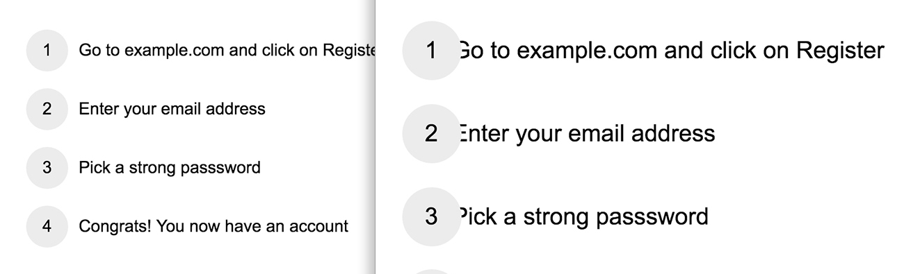
<ul class="list">
  <li>Go to example.com and click on Register</li>
  <li>Enter your email address</li>
  <li>Pick a strong password</li>
  <li>Congrats! You now have an account</li>
</ul>
.list li {
position: relative;
padding-left: 3.125em;
margin-bottom: 1em;
min-height: 2.5em;
}
.list li:before {
font-size: 1em;
width: 2.5em;
height: 2.5em;
text-align: center;
line-height: 2.5em;
border-radius: 50%;
}Happy scaling:
Positioned Icon a List/Alert/Modal
I think you’re getting the point now, so let’s do a few more examples with just a demo where you can see for yourself how relative scaling is helpful:
Hamburger Menu Icon
Perhaps you’ve “faked” an icon by building it out of elements and pseudo elements. That should be scaleable too.
Gradients
We already looked at how we can use relative units for background-size. We also eluded to the fact that a color stop in a gradient could be set with a relative unit. Let’s do just that!
.box-1 {
  background:
    linear-gradient(
      to right,
      #4a90e2 0,
      #4a90e2 0.625em,
      #1b5dab 0.625em,
      #1b5dab 1.875em,
      #4a90e2 0,
      #4a90e2 3.125em
    );
  background-size: 1.25em 100%;
}Image Sprites
Some things have fixed sizes that are a lot easier to think about in pixels, like raster images. But that doesn’t mean we still can’t work with them in relative units. If we combine background-position and background-size in ems, we can use CSS sprites that can scale in size.
Combining em and rem
We’ve mainly used the em unit throughout this article. We established that the em unit is based on font-size and cascades. But em has a cousin unit: rem. The rem unit is still relative, but relative only to the root (e.g. html {} or :root {}). So it doesn’t really cascade like em does, but if you change the root font-size, it will change accordingly.
By combining em and rem, we can keep some sizes fixed and keep the other dynamic. For example, say you wanted the text in these components to be only relative to the root, but have other elements be relative to the more immediate font size. Like the image, for example:

See how adjusting the immediate font-size only affects the image now:
Building a complete site with relative sizes
I built an entire page to demonstrate how we can apply the concept of dynamic components to something real-world and not just isolated to a single example.

Everything here is dynamically sized: logo, tags, title, author, section title, numbered lists, form inputs, buttons, blockquotes… just about everything.

If we were to change the default browser font size from 16px to 20px, this is how the site scales:

Awesome, right? Did you notice how everything scaled, not just the type? That’s the beauty of em! 😍
Note that the font-size changes with a media query breakpoint as well.
Zooming
Our em-based design is happily compatible with browser zooming as well.

While the pixel-based design can run into issues:

Challenges with em
One thing to keep in mind when using em is that when you set the font-size in it, it’s based on the nearest parent element with a declared font-size.
.parent {
  font-size: 20px;
  .child {
    /* This is based on 20px, so it's 30px */
    font-size: 1.5em;
  }
}
I think we’ve established that pretty clearly.
But when we size other things in em, it’s now based on the newly-adjusted font-size of the current element. For example:
.parent {
  font-size: 20px;
  .child {

    /* This is based on 20px, so it's 30px */
    font-size: 1.5em;

    /* This is based on 1.5em (not 20px), so it's also 30px */
    border: 1em solid black;

  }
}
It just can be weird to see two different em values in the same element evaluating to the same end value.
This is in addition to the fact that the cascading effect of ems is sometimes challenging in itself. If you size things inside components in ems and those components can be nested, that can cause cascading of sizes that may be undesirable.

Closing up
- Sizing in pixels is harder to maintain. They aren’t relative to anything else. You need to manually adjust all of them to change a proportion. Difficult, time consuming, error prone.
- Settings values in ems makes things proportional to the font-size, so changing the font-size scales all the values on that element (and cascades to the children).
- Setting font sizes in pixels may prevent the user from changing their default font size via their browser settings, which is no good for accessibility.
Mark Boulton, SitePoint Podcast Interview
Fantastic, ground-breaking post. Thorough and solid. Bookmarked.
Great post. I hope this sets the pace and replaces font-size:76% on the element as a crutch.
My understanding is that this is no longer an issue in any modern browser, so I wouldn’t necessarily say that people should use these techniques for accessibility.
The corresponding WCAG 2.0 guideline (1.4.4) is practically impossible to fail these days. :)
Compare CSS-Tricks.com and americanpressinstitute.org at different font sizes set by your browser and you’ll see a stark difference.
In Chrome, go to Settings and search for Font Size ( or put this in the URL bar chrome://settings/search#font).
In Firefox, go to Preferences, Content, and increase the font size.
Set the font size to very large and compare the two sites. CSS-Tricks is laid out in pixels and this looks nearly the same. The American Press Institute site is laid out using ems so it scales relative to the font size set by the browser.
Why is this important in terms of accessibility? Those with low-vision need larger font sizes to read. They could go to every site and hit Control or Command + a couple of times to scale the website up. Or they could change the default font size setting of the browser and be done for all sites they visit. A well designed site with this use case in mind should adjust to the readers preference for a larger font size.
This is really awesome, but I highly recommend using a helper function instead of manually calculating your ems:
This makes it a lot easier to maintain your code, especially when someone else picks it up and has to tweak the styles.
It also helps with situations like this:
Oops.
.foo-barisn’t going to default to12px, it’s going to default to15px, but we don’t want that.Instead, we can do:
Ah, much better.
20 / 16 = 1.25ems for.foo, and then12 / 20 = 0.6ems for.foo-bar, but keep in mind that0.6 * 1.25 * 16px = 12px, which is what we wanted.This also helps with related properties, as described in the article.
That’ll give us a desired default of a
2pxborder, even if$font-sizeis changed. And, of course, it’ll scale with the component.Wait, you’re already doing this in your example pens. Why are the written examples in the article showing with
ems? You should just show yourem()helper right from the start, it solves a lot of the challenges at the end of the article.Hi Agob,
Thanks so much for your suggestion. You’re right, We are using a Sass function to help in calculating the
emvalue. The code snippets useemunits just to make it simple for people who are not aware of CSS Pre-Processors. I think that it’s important to explain things in CSS (behind the scenes) instead of just showing a specific Sass function.I will find a way to add a section on using the Sass function so more people can learn about that.
Thanks again,
Nice article. I have been using px for very long time and i am planning to move to relative units. I have a questions. If we specify parent font size in px, child elements with em will use that. But if we don’t specify font size to parent, what font size it take?
Thank you
Thanks Ashok!
Nice question :) If we don’t specify a
font-size, it will inherit from the closest parent with a specifiedfont-size. If not, it will inherit from the root elementhtml.Hope that helps.
Thank you…
Great article. Helpful and well explained. Very good examples, thankyou.
Love this post .. best of all I have read on css-tricks.
Nice round-up! The demos illustrate perfectly how powerful ems are and I hope to see many more folks adopting this method globally in their designs.
I’ve made a few sites using only ems and it makes life so much easier when incrementally upscaling for oversized “desktop” displays; just increase the root font-size in a media query and BAM! Everything proportionally bigger with only one little edit :)
One thing I’ve tried is using em for sizing throughout with a root font-size set with vw. This makes the site scales proportionately as the browser is resized. I set some media query breakpoints that raise/lower the root vw, and adjust design as needed.
Would you mind to post some code for illustration? Thanks!
I am doing this in some components and I really like it. I will work even harder on em’s. Your post is a must read.
Amazing, bookmarked!!
Comments are helpful too
Very nice article.
Disagree with the comments on font-size and accessibility. Yes most browsers can scale even fixed fonts these days, but not always, and it is tested for so why not mention it as a plus since it’ll fill in the small gaps?
Would be nice if your svg examples used aria or similar so you show everything with the most accessibility possible (without over doing it), to go with all the other meticulously done things shown.
Could someone please explain me why we want the scaling in the first place?
When ever I encounter an article that touts the wonders of em or rem scaling I never see a good explanation for scaling like this. Everyone just seems to jump to the nitty gritty of the tech instead of talking about why.
As a sidenote ie9 started supporting font scaling even with px values and even before that many browser vendors started supporting zooming. You can actually zoom the website with code simply by setting
html{zoom:150%;}If you’re talking about scaling based on browser width, what are the optimal values to scale, how did you come up with them and why?
Very helpful article. I was looking forward using proportional units for long but didn’t really find an article explaining it with this amount of examples showing every side of it. I am having a new project coming up soon and I am planning to start using the proportional units. With this article as reference, I wouldn’t fear getting lost in the woods :D