CSS-Tricks
  • Articles
  • Alamanac
  • Guides
  • Videos
  • Books
  • Newsletter
Search

Articles Tagged
responsive images

34 Articles
{
,

}
Direct link to the article w descriptors and sizes: Under the hood
responsive images

w descriptors and sizes: Under the hood

Eric Portis digs into how the browser decides which image to downloads when you give it <img srcset="" sizes"">. Notably, a browser can do whatever it wants:

Intentionally un-specified behavior lets browsers provide innovative answers to an open-ended question.

…
Avatar of Chris Coyier
Chris Coyier on Apr 1, 2018 (Updated on Apr 13, 2018)
Direct link to the article Fallbacks for Videos-as-Images
gif responsive images safari video

Fallbacks for Videos-as-Images

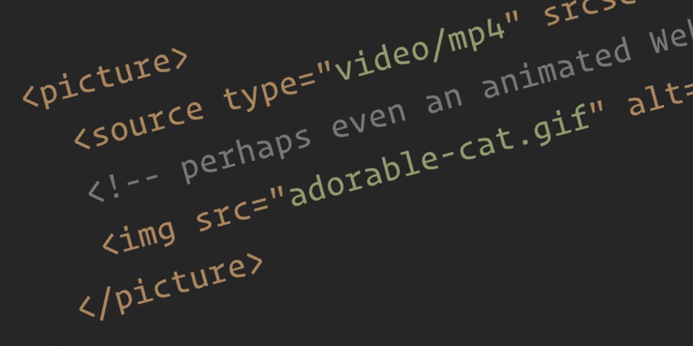
Safari 11.1 shipped a strange-but-very-useful feature: the ability to use a video source in the <img /> tag. The idea is it does the same job as a GIF (silent, autoplaying, repeating), but with big performance gains. How big? “20x …

Avatar of Chris Coyier
Chris Coyier on Feb 7, 2018
Direct link to the article #155: Responsive Images, WordPress, and Cloudinary
cloudinary responsive images WordPress

#155: Responsive Images, WordPress, and Cloudinary

Eric Portis joins me to dig into the world of responsive images.

We start at the basics. Responsive images are specifically images in HTML and exist because of a desire for better performance. Images are probably the biggest culprit in …

Avatar of Chris Coyier
Chris Coyier on Jun 22, 2017
Direct link to the article Responsive Images in WordPress with Cloudinary, Part 2
cloudinary responsive images WordPress

Responsive Images in WordPress with Cloudinary, Part 2

In Part 1 of this series, I provided some background on responsive images, describing how you can add srcset and sizes attributes to an img element to serve appropriately sized image files to users of a website based on the …

❥ Sponsored
Direct link to the article Responsive Images in WordPress with Cloudinary, Part 1
cloudinary responsive images

Responsive Images in WordPress with Cloudinary, Part 1

In this post we'll look at a brief history of responsive images and why they are so important for performant websites. Then we'll look at how WordPress helps automate that, and ultimately how the whole situation gets a lot better by leveraging Cloudinary.

❥ Sponsored
Direct link to the article The “Optimal Image Format” for Each Browser
performance responsive images

The “Optimal Image Format” for Each Browser

Perhaps you’ve heard about the WebP image format? And how it’s a pretty good performance win, for the browsers that support it? Well that’s only for Blink-based browsers, at the moment. Estelle Weyl’s article Image Optimization explains the best image …

Avatar of Chris Coyier
Chris Coyier on Dec 24, 2016 (Updated on May 31, 2017)
Direct link to the article Exporting Images in Multiple Resolutions Simultaneously
adobe responsive images sketch

Exporting Images in Multiple Resolutions Simultaneously

It’s always nice to see design tooling evolve to accommodate modern needs. Let’s look at an example of that: image exporting. Designers and developers spend loads of time exporting images. The design work often happens in software designed for designing, …

Avatar of Chris Coyier
Chris Coyier on Dec 22, 2016 (Updated on May 4, 2020)
Direct link to the article Responsive Images in CSS
responsive images

Responsive Images in CSS

The term “responsive images” has come to mean “responsive images in HTML”, in other words, the srcset and sizes attribute for <img /> and the <picture></picture> element. But how do the capabilities that these things provide map to CSS?…

Avatar of Chris Coyier
Chris Coyier on Oct 24, 2016 (Updated on Jul 14, 2017)
Direct link to the article Responsive Image Breakpoints Generator
responsive images rwd

Responsive Image Breakpoints Generator

I’m guilty of using responsive images by taking a high res image and downsizing it a few times kinda randomly and using those as the srcset images. Basically the same “desktop”, “tablet”, “mobile” thinking I can also be guilty of …

Avatar of Chris Coyier
Chris Coyier on Oct 6, 2016
Direct link to the article The Responsive Image Breakpoints Generator
responsive images

The Responsive Image Breakpoints Generator

Nadav Soferman has written a great post about the common mistakes that can be made when developers attempt to make images responsive:

Whichever responsive design solution or framework you choose, you still need to generate and deliver multiple versions of

…
Avatar of Robin Rendle
Robin Rendle on Jan 27, 2016 (Updated on Jun 3, 2016)
Direct link to the article Responsive Images in WordPress Core
responsive images

Responsive Images in WordPress Core

In April 2014 Tim Evko created a WordPress plugin that used the CMS’s capabilities to make using responsive images much easier (just do what you were already doing, reap benefits). He wrote about it here. Later it became the official …

Avatar of Chris Coyier
Chris Coyier on Oct 15, 2015 (Updated on Jun 3, 2016)
  • Newer
  • 1
  • 2
  • 3
  • ...
  • 4
  • Older

CSS-Tricks is powered by DigitalOcean.

Keep up to date on web dev

with our hand-crafted newsletter

DigitalOcean
  • About DO
  • Cloudways hosting
  • Legal stuff
  • Get free credit!
CSS-Tricks
  • Write for us!
  • Advertise with us
  • Contact us
Social
  • RSS Feeds
  • CodePen
  • Mastodon
  • X
Back to Top