CSS-Tricks
  • Articles
  • Alamanac
  • Guides
  • Videos
  • Books
  • Newsletter
Search

Articles Tagged
flexbox

41 Articles
{
,

}
Direct link to the article Chromium lands Flexbox gap
flexbox gap grid

Chromium lands Flexbox gap

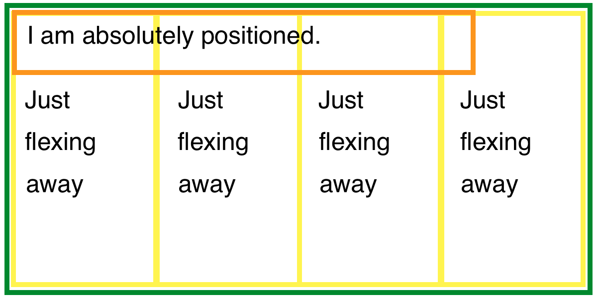
I mentioned this the other day via Michelle Barker’s coverage, but here I’ll link to the official announcement. The main thing is that we’ll be getting gap with flexbox, which means:

.flex-parent {
  display: flex;
  gap: 1rem;
}
.flex-child 
…
Avatar of Chris Coyier
Chris Coyier on May 8, 2020
Direct link to the article Exciting Things on the Horizon For CSS Layout
flexbox gap grid layout

Exciting Things on the Horizon For CSS Layout

Michelle Barker notes that it’s been a heck of a week for us CSS layout nerds.

  1. Firefox has long had the best DevTools for CSS Grid, but Chrome is about to catch up and go one bit better by visualizing
…
Avatar of Chris Coyier
Chris Coyier on May 7, 2020
Direct link to the article Flexbox and absolute positioning
absolute position flexbox

Flexbox and absolute positioning

Chen Hui Jing notes that when you absolutely position a flex item, it’s no longer part of the flex layout. Except… it kinda is a little bit. If you make the child position: absolute; but don’t apply any top/right/bottom/left properties, …

Avatar of Chris Coyier
Chris Coyier on Mar 18, 2020
Direct link to the article How Auto Margins Work in Flexbox
flexbox margin

How Auto Margins Work in Flexbox

Robin has covered this before, but I’ve heard some confusion about it in the past few weeks and saw another person take a stab at explaining it, and I wanted to join the party. …

Avatar of Chris Coyier
Chris Coyier on Jan 6, 2020
Direct link to the article The Thought Process Behind a Flexbox Layout
flexbox

The Thought Process Behind a Flexbox Layout

I just need to put two boxes side-by-side and I hear flexbox is good at stuff like that.

Just adding display: flex; to the parent element lays out the children in a row.

Well, that’s cool. I guess I could …

Avatar of Chris Coyier
Chris Coyier on Nov 26, 2019 (Updated on Feb 3, 2021)
Direct link to the article Adaptive Photo Layout with Flexbox
flexbox images

Adaptive Photo Layout with Flexbox

Let’s take a look at a super lightweight way to create a horizontal masonry effect for a set of arbitrarily-sized photos. Throw any set of photos at it, and they will line up edge-to-edge with no gaps anywhere.

The solution …

Avatar of Tim Van Damme
Tim Van Damme on Oct 3, 2019
Direct link to the article Overflow And Data Loss In CSS
flexbox grid overflow

Overflow And Data Loss In CSS

“Data Loss” is a funny term. My brain thinks of it like packet loss on the way from the server to your browser, resulting in missing content in files. Perhaps it is that on some level, but in CSS parlance, …

Avatar of Chris Coyier
Chris Coyier on Sep 17, 2019
Direct link to the article Making width and flexible items play nice together
flex-basis flex-shrink flexbox

Making width and flexible items play nice together

The short answer: flex-shrink and flex-basis are probably what you’re lookin’ for.…

Avatar of Robin Rendle
Robin Rendle on Jul 1, 2019
Direct link to the article Grid, content re-ordering and accessibility
accessibility flexbox grid

Grid, content re-ordering and accessibility

Take this:

<ol>
  <li>Get hungry</li>
  <li>Order pizza</li>
  <li>Eat pizza</li>
</ol>

That HTML ends up in the DOM that way (and thus how it is is exposed to assistive technology), and by default, those list items are also visually shown in …

Avatar of Chris Coyier
Chris Coyier on Jun 12, 2019
Direct link to the article Responsive Designs and CSS Custom Properties: Building a Flexible Grid System
css variables flexbox grid responsive

Responsive Designs and CSS Custom Properties: Building a Flexible Grid System

Last time, we looked at a few possible approaches for declaring and using CSS custom properties in responsive designs. In this article, we’ll take a closer look at CSS variables and how to use them in reusable components and …

Avatar of Mikolaj Dobrucki
Mikolaj Dobrucki on Feb 26, 2019
Direct link to the article IE10-Compatible Grid Auto-Placement with Flexbox
flexbox grid internet explorer

IE10-Compatible Grid Auto-Placement with Flexbox

If you work on web applications that support older browsers, and have lusted after CSS Grid from the sidelines like I have, I have some good news: I’ve discovered a clever CSS-only way to use grid auto-placement in IE10+!

Now, …

Avatar of Brian Holt
Brian Holt on Feb 18, 2019
  • Newer
  • 1
  • 2
  • 3
  • ...
  • 4
  • Older

CSS-Tricks is powered by DigitalOcean.

Keep up to date on web dev

with our hand-crafted newsletter

DigitalOcean
  • About DO
  • Cloudways hosting
  • Legal stuff
  • Get free credit!
CSS-Tricks
  • Write for us!
  • Advertise with us
  • Contact us
Social
  • RSS Feeds
  • CodePen
  • Mastodon
  • X
Back to Top