::selection
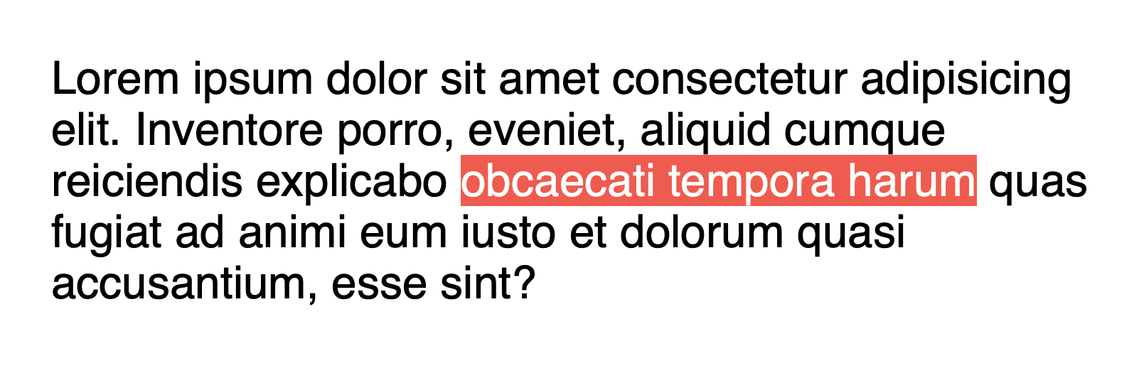
Use your cursor select this sentence. Notice how as you select the text a background color fills the space? You can change the background color and color of selected text by styling ::selection. Styling this pseudo element is great …
Use your cursor select this sentence. Notice how as you select the text a background color fills the space? You can change the background color and color of selected text by styling ::selection. Styling this pseudo element is great …
Columns do a great job of flowing and balancing content. Unfortunately, not all elements flow gracefully. Sometimes elements get stuck between columns.
Fortunately, you can tell the browser to keep specific elements together with break-inside.
li {
-webkit-column-break-inside: avoid;
To make columns distinct, you can add a vertical line between each column. The line sits in the center of the column gap. If you’ve ever styled border, then you are ready to style column-rule.
.container {
-webkit-columns: When you want to keep your columns at a specific width, use column-width.
section {
-webkit-column-width: 200px;
   -moz-column-width: 200px;
        column-width: 200px;
}
The browser will calculate how many columns of at least that width can fit in the space. …
In a multi-column layout, you can make elements expand across the columns with column-span.
h2 {
 -webkit-column-span: all;
         column-span: all;
}
Assign column-span to an element inside of the multi-column layout to make it a spanning element. The …
When you add height to a multi-column element, you can control how the content fills the columns. The content can be balanced or filled sequentially.
ul {
  height: 300px;
  -webkit-columns: 3;
     -moz-columns: 3;
          columns: 3;
  -moz-column-fill: balance;
       column-fill: balance;
}If you need an exact numbers of columns when designing a multi-column layout, use column-count.
.lead {
  column-count: 3;
 }
Given the number of columns, the browser will evenly distribute the content in exactly that number of columns.
This …
With just a few CSS rules, you can create a print-inspired layout that has the flexibility of the web. It’s like taking a newspaper, but as the paper gets smaller, the columns will adjust and balance automatically allowing the content …
With CSS columns you can create a print-inspired layout with little added markup that can adapt beyond a fixed canvas. A supported browser will make calculations to wrap and balance content into tidy columns. If you’re already working with a …