Articles Tagged
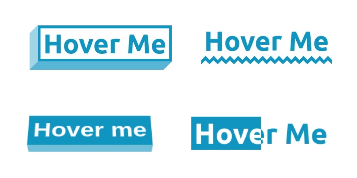
Cool CSS Hover Effects That Use Background Clipping, Masks, and 3D
We’ve walked through a series of posts now about interesting approaches to CSS hover effects. We started with a bunch of examples that use CSS background properties, then moved on to the text-shadow property where we technically didn’t use …
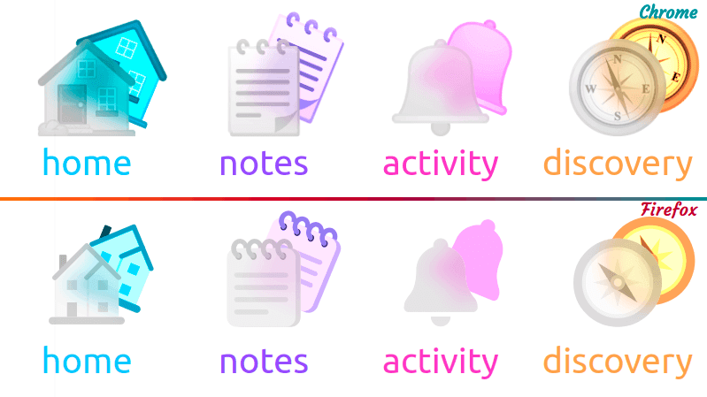
Icon Glassmorphism Effect in CSS
I recently came across a cool effect known as glassmorphism in a Dribble shot. My first thought was I could quickly recreate it in a few minutes if I just use some emojis for the icons without wasting time …
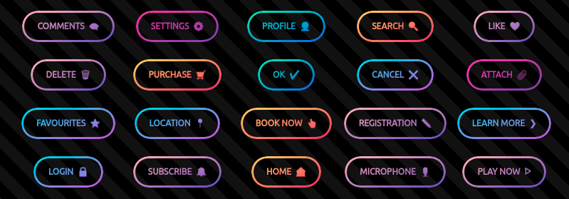
CSS-ing Candy Ghost Buttons
Recently, while looking for some ideas on what to code as I have zero artistic sense so the only thing I can do is find pretty things that other people have come up with and remake them with clean and …
Nested Gradients with background-clip
I can’t say I use background-clip all that often. I’d wager it’s hardly ever used in day-to-day CSS work. But I was reminded of it in a post by Stefan Judis, which coincidentally was itself a learning-response post to …
Multiple Background Clip
You know how you can have multiple backgrounds?
body {
  background-image:
    url(image-one.jpg),
    url(image-two.jpg);
}
That’s just background-image. You can set their position too, as you might expect. We’ll shorthand it:
body {
  background:
    url(image-one.jpg) no-repeat top right,
url(image-two.jpg) The `background-clip` Property and its Use Cases
background-clip is one of those properties I’ve known about for years, but rarely used. Maybe just a couple of times as part of a solution to a Stack Overflow question. Until last year, when I started creating my huge collection …
background-clip
background-clip lets you control how far a background image or color extends beyond an element’s padding or content.
.frame {
  background-clip: padding-box;
}border-boxis the default value. This allows the background to extend all the way to the
