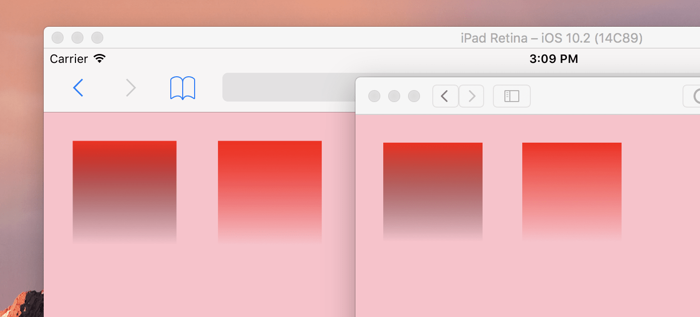
Say you have a gradient in CSS that goes from red to transparent. Easy, right? Like this:
.element {
  background: linear-gradient(
    to bottom,
    red,
    transparent
  );
}
There is a pretty big gotcha here, though.
In Chrome (also Android), Firefox, and Edge, you’d be all good.

But in Safari (also iOS), you’d not be good.

The problem, the best I understand it, is that transparent is being interpreted (and interpolated) as “transparent black”.
To fix it, you have to set the color as a fully transparent version of that exact color. Like:
.element {
  background: linear-gradient(
    to bottom,
    red,
    rgba(255, 0, 0, 0)
  )
}
That’s not always easy with a hex code, since it’s not obvious what the RGBa or HSLa equivalent is. It’s not hard to find a color converter though, just web search around.
The CSS Level 4 color() function will make this easier, Like:
.element {
  background: linear-gradient(
    to bottom,
    #eb8fa9,
    color(#eb8fa9 alpha(0%)) /* or is it color-mod()? */
  )
}
But the support for that isn’t around yet.
Sass can help out, if you are using that:
.element {
  background: linear-gradient(
    to bottom,
    #eb8fa9,
    rgba(#eb8fa9, 0);
  )
}
transparentbeing transparent black is according to the spec. I warned people about it for years. Browsers only changed their behaviour within the last two or three years, changing their treatment of transparent colours away from the strictly correct to what most people actually wanted. Not sure if this change matches any spec anywhere. I wasn’t aware iOS hadn’t changed yet—it seems probable that it will.Note also that you get the same issues in CSS shapes (I believe I commented on the article here) due to antialiasing (you end up with what is essentially a one-pixel-wide gradient).
It’s in the CSS CSS Image Values and Replaced Content Module Level 3, which has been stable (Candidate Recommendation status) since 2012. Note Example 23 in that section.
Cheers for this but let me get this straight then Chris, as long as the “transparency” is based on the alpha colour this doesn’t happen on Safari?
I was just building something with a linear gradient background and knowing this I’ll check to be sure I’m handling things the right way, now and forever more!
Thank goodness I’m using Sass eh? ;-)
#phew!
Gradients are often the same way in design apps (Sketch, Adobe, etc.). I’ve always written my gradients this way thinking the logic would be the same in-browser.
Yep. Same here.
Most modern editors include a function or add-on to switch a color between different formats (such as “Pigments” in Atom). You could also preview the hex color in Safari or Chrome and use the Developer Tools in either. Shift-clicking on the color swatch switches between the various color formats.
This isn’t just a problem with browser interpretation. It’s been like this for awhile in photoshop. I would make sprites with white outlines and the outside transparent pixels when cropping them would be black and create weird artifacts in the game engine. It took forever to figure out that this was the issue. Glad people are recognizing it on a wider scale and coming up with solutions.
Another possible syntax would be:
Supported in Chrome 52 and Firefox 49; you’ll need a postcss plugin like
postcss-color-hex-alphato convert this syntax to the backwards compatiblergba()syntax.TL;DR transparent == #0000, not the previous with 0% alpha.
“CSS Color Level 4” is in progress by WebKit (Safari) https://webkit.org/status/#specification-css-color-level-4
till then WebKit might fix “Color interpolation for colors with alpha incorrect (gradients)” https://bugs.webkit.org/show_bug.cgi?id=150940, so the
color(#eb8fa9 alpha(0%))approaches might be irrelevant.Blatant self-promotion, I know, but I wrote a PostCSS plugin to deal with this specific situation: https://github.com/gilmoreorless/postcss-gradient-transparency-fix/
I think Safari’s way of doing this is vastly more flexible, even if it is a bug, as Binyamin shows above. If you set a color with 0% alpha and use it in a gradient, Safari will blend it between the other colors smoothly. In Chrome and Firefox (for example), no matter the RGB values you set, it will look the same as transparent white. Compare this demo in Safari and Chrome or Firefox:
http://codepen.io/smcginnis/pen/egVLJE
Also try playing around with the alpha value – it becomes less apparent at higher values (.25 works pretty well), but the blending is still different.
Also, sorry if there isn’t enough contrast between the solid color-stop and the background; this demo was just for fun before I realized it only worked in Safari and remembered this post. Try changing
#coffeetolimeto make it easier to see.